Blog
Tutorials
How to Build an App Store Product Page 2026
Learn how to build an App Store product page in 2026 — metadata limits, screenshot specs, app previews, and A/B tests that boost conversions.

Nafis Amiri
Co-Founder of CatDoes

TL;DR: Your App Store product page is the listing people see before they tap "Get." To build one that converts, you fill in five text fields (app name, subtitle, keywords, promotional text, and description), upload up to 10 screenshots and 3 app preview videos, and add your icon. The 30-character name and subtitle plus the 100-character keyword field drive search ranking; the screenshots and first three lines of your description drive installs. In 2026 you can also A/B test your page and run up to 70 custom product pages, including in organic search, to push conversion higher.
Getting your app approved is only half the battle. Your App Store product page is where curious users decide whether to install or scroll past, and most first-time founders treat it as an afterthought. In this guide, you'll learn exactly what goes on the page, the current 2026 character limits and screenshot specs straight from Apple, and the optimization tools that can lift your conversion rate by double digits. By the end, you'll be able to build a product page that ranks, reads well, and earns the tap.
Table of Contents
What Is an App Store Product Page?
What You Need Before You Start
App Name and Subtitle
The Keywords Field
Promotional Text and Description
Screenshots: Specs and Strategy
App Preview Videos
Your App Icon
Custom Product Pages and A/B Testing
Common Mistakes That Get You Rejected
Frequently Asked Questions
What Is an App Store Product Page?
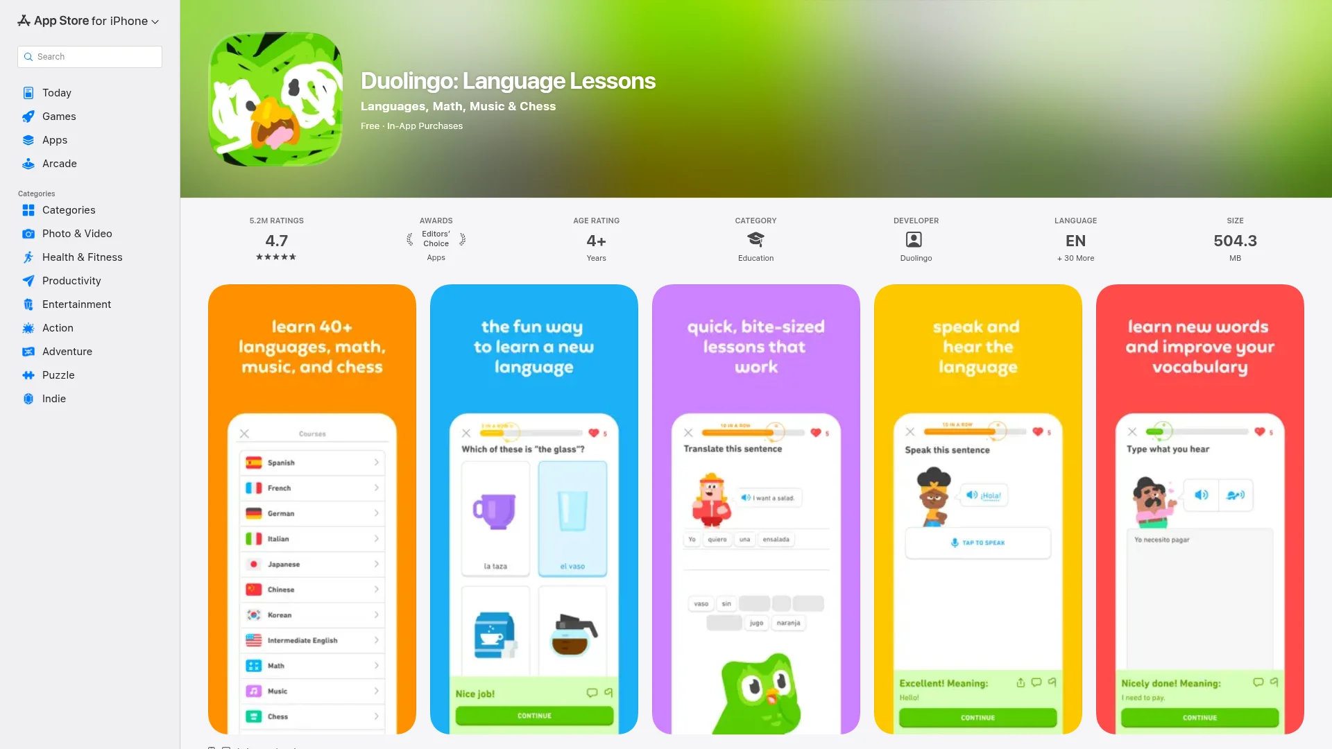
An App Store product page is the public listing for your app on Apple's App Store. It's the single screen that shows your icon, name, ratings, screenshots, preview videos, and description: everything a person sees after searching or tapping an ad. Think of it as your app's landing page: its only job is to turn a viewer into a download.
The page has two distinct halves. The metadata (name, subtitle, and keywords) decides whether you show up in search at all. The visuals and copy (screenshots, previews, and description) decide whether anyone who finds you actually installs. Strong screenshots alone can add a 20-40% conversion boost, so both halves matter.
What You Need Before You Start
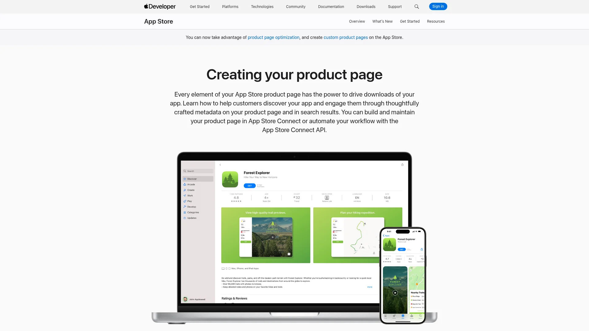
You build the entire product page inside App Store Connect, Apple's web dashboard for managing apps. To get there, you need an active Apple Developer Program membership ($99/year), which unlocks App Store Connect, TestFlight, and the tools required to submit. If you haven't enrolled yet, our guide on how to submit an app to the App Store walks through account setup and the full review flow.
Before you open the editor, gather these assets so you're not scrambling field by field:
A 1024×1024 app icon (no transparency, no rounded corners; Apple adds those)
At least 4-5 screenshots in the correct base sizes
Your finalized name, subtitle, and keyword list
A description draft and a 170-character promotional line
Optional: one to three app preview videos
App Name and Subtitle
Your app name and subtitle are the two most valuable fields on the entire page. They're indexed for search and carry the most weight in ranking. Each is capped at 30 characters, so every character counts.
Use the name for your brand plus your single most important keyword (for example, "Notso: Habit Tracker"). Use the subtitle for a second benefit or keyword phrase that the name didn't cover. Don't waste either on filler like "the best app for." Both fields require a new app version to change, so lock them in before you submit.
Field | Limit | Indexed for search? |
|---|---|---|
App Name | 30 characters | Yes (highest weight) |
Subtitle | 30 characters | Yes (secondary weight) |
Keywords | 100 characters | Yes (hidden field) |
Promotional Text | 170 characters | No |
Description | 4,000 characters | No (Apple only) |
The Keywords Field
The keywords field is a hidden, 100-character box that feeds Apple's search index; users never see it. Separate terms with commas and no spaces (for example, "budget,money,expense,saving"). You can use spaces inside a single phrase like "real estate," but the comma is what splits one keyword from the next.
To squeeze the most coverage out of 100 characters, follow Apple's own advice: don't repeat any word already in your name, subtitle, or category, skip plurals of words you've used, and drop generic terms like "app" or filler like "the." Each unique word can recombine with others, so a tight, non-repeating list ranks for far more phrases than a padded one.
Promotional Text and Description
Promotional text is a 170-character line that sits at the very top of your description. It isn't indexed for search, but it's the only text field you can update anytime without shipping a new version, perfect for announcing a sale, a feature, or seasonal news. Don't stuff keywords here; it won't help ranking.
The description itself allows up to 4,000 characters of plain text (no bold, italics, or images). On Apple, the description is not indexed for search at all. It exists purely to convince. That makes the first three lines (roughly the first 225 characters shown before the "more" tap) the most important copy on the page.
Pack those opening lines with three things: what the app does, the core benefit, and proof people use it. A strong opener reads like "Track every dollar automatically and save an average of $340 a month. Trusted by 2M+ people." Then structure the rest for scanners:
Social proof: ratings, download counts, or press mentions
4-6 key features written as benefits, not specs
A simple "how it works" in three steps
Clear pricing: what's free and what costs money
Write features as outcomes. Instead of "Push notifications," write "Never miss a bill. Smart reminders alert you before every due date." If you're also shipping to Android, note that Google Play does index your description, so the keyword strategy differs. See our guide on how to publish an app on Google Play.
Screenshots: Specs and Strategy
Screenshots are your single most powerful conversion tool after the icon, and the first two do most of the work because many users never scroll further. You can upload up to 10 per localized listing; Apple recommends at least 4-5 to tell a complete story.
In 2026, Apple simplified the size requirements. You only need to upload two base sizes, and Apple automatically scales them for smaller devices:
Device | Base size (portrait) |
|---|---|
6.9" iPhone | 1320 × 2868 px |
13" iPad | 2064 × 2752 px |
Export flattened PNG or JPG files in RGB with no alpha channel, and match your app's real orientation. Apple's automated checks are stricter than ever on resolution, scaling, and safe areas, so design at the exact dimensions. Don't upscale, stretch, or add black bars. Give each screenshot a short 5-8 word caption that sells a benefit, not a feature.
One compliance rule trips up a lot of new apps: screenshots can only show content captured from inside your app, and they can't display features, pricing, or claims a user won't actually see after installing. Avoid superlatives, references to other platforms ("Best on Android"), and calls to action like "Download now."
App Preview Videos
App previews are short, autoplaying videos that show your app in action. You can add up to three per page, each 15-30 seconds, in H.264 or ProRes 422 (HQ), under 500 MB. They must be recorded from within the app. Animated mockups aren't allowed.
Orientation changes where the video appears. A portrait preview takes the first slot on your product page; a landscape preview can surface in search results. Either way, the opening few seconds need to be visually compelling because the video plays muted by default. A well-made preview can lift conversion meaningfully, but it's optional. Many strong pages run on screenshots alone.
Your App Icon
Your icon is the very first thing a user sees in search, on the page, and on their home screen. Keep it simple, recognizable, and legible at small sizes. Avoid fine detail and text. Upload a 1024×1024 PNG with no transparency and square corners; Apple applies the rounded mask automatically.
If you want to test more than one icon later, build the alternates into your app binary as alternate icons (Xcode 13 or later). That's the only way Apple will let you A/B test icons, which we'll cover next.
Custom Product Pages and A/B Testing
Once your default page is live, two free Apple tools help you push conversion higher: Product Page Optimization (PPO) and Custom Product Pages (CPPs). They sound similar but do different jobs.
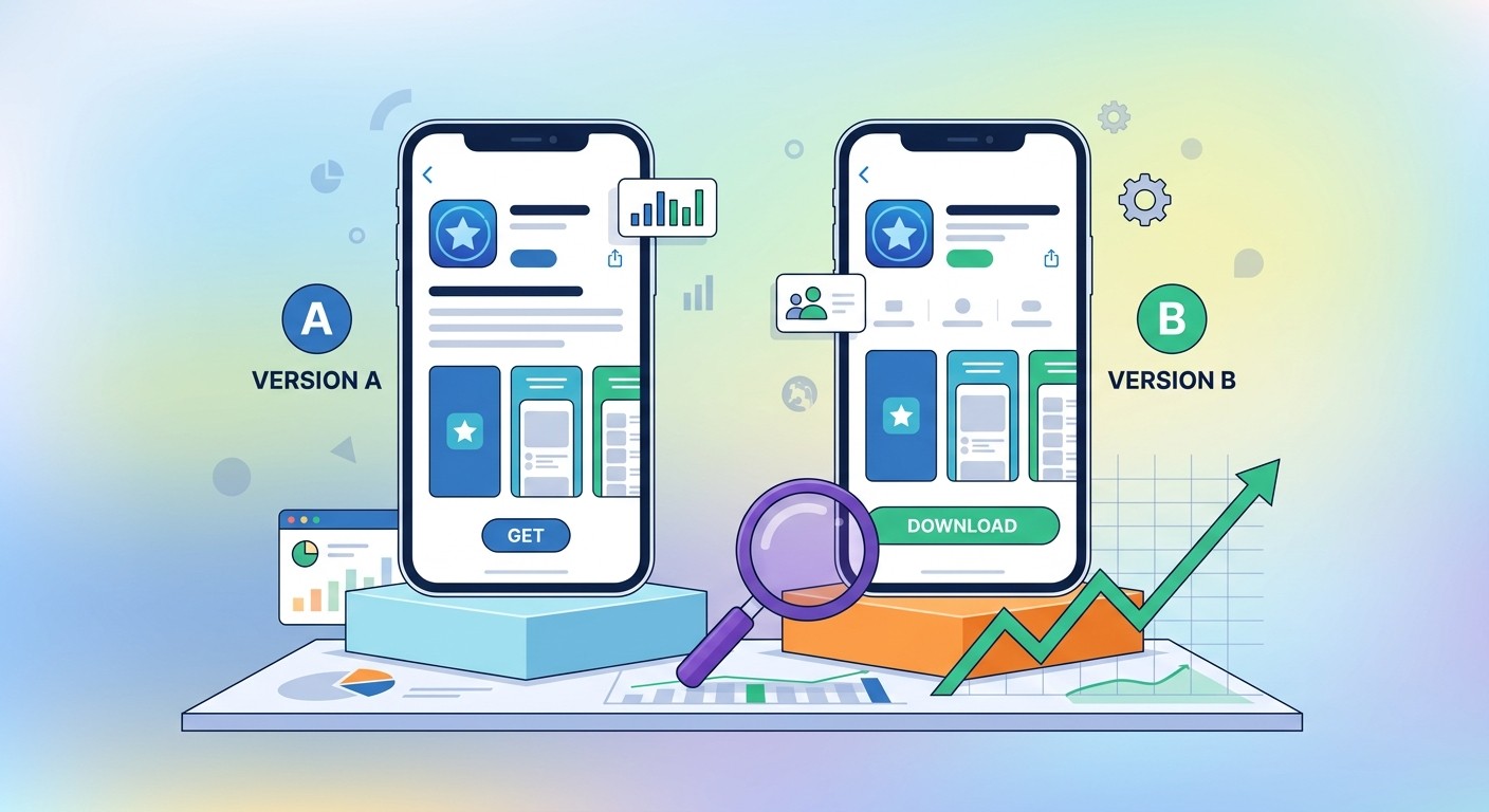
Product Page Optimization is A/B testing for your default page. You create up to three treatments, each a copy of your page with different icons, screenshots, or previews. Choose what share of traffic sees them, and let the test run up to 90 days. App Analytics tells you the winner with at least 90% confidence, and you set it live for everyone. You can only run one test at a time, and you can't test metadata text.
Custom Product Pages are always-on alternate pages, each with its own URL, screenshots, and messaging tuned to a specific audience or campaign. The big 2025-2026 shift: Apple now lets CPPs appear in organic search (not just paid links) and raised the limit to 70 pages per app. Apps actively using CPPs see conversion lifts up to 8.6% on average, with documented case studies reaching 20-33%.
Start small: three to five pages mapped to your highest-priority audiences, and feed your winning CPP ideas back into PPO tests on the default page. For the broader playbook, see our App Store optimization tips for 2026.
Common Mistakes That Get You Rejected
Most product page rejections come from a handful of avoidable errors. Steer clear of these:
Screenshots showing features or pricing the installed app doesn't have
References to other platforms or "Download now" calls to action in visuals
Keyword stuffing in the name, subtitle, or promotional text
Using competitor names or unauthorized trademarks in keywords
Low-resolution or stretched screenshots that fail the 2026 automated checks
Remember that 2026 ranking also weighs engagement: apps with strong Day-7 retention now rank above apps with more downloads but weaker stickiness. A polished product page gets the install, but a stable, useful app keeps the ranking.
Frequently Asked Questions
How long does it take to build an App Store product page?
The fields themselves take an hour or two to fill in. Producing polished screenshots and a preview video usually takes a day or two, depending on how much design work you do.
Can I change my product page after launch?
Promotional text and review responses update anytime. The name, subtitle, keywords, description, and screenshots are tied to an app version, so changing them means submitting an update.
How many screenshots should I upload?
You can add up to 10, but Apple recommends at least 4-5. Make the first two count. Many users decide based on those alone.
Does my description affect App Store search ranking?
No. On the Apple App Store, only the name, subtitle, keyword field, and category are indexed for search. The description is a conversion tool. On Google Play, the description is indexed.
What's the difference between PPO and custom product pages?
PPO is an A/B test of your default page across all organic traffic. Custom product pages are always-on alternate pages targeted at specific audiences, each with a unique URL.
Ship Your Product Page Faster
A great App Store product page is part craft, part testing. Get the metadata and screenshots right, then optimize with PPO and custom pages over time. If you'd rather spend that energy on the app itself, CatDoes builds, deploys, and ships your app to the App Store from a single prompt, so you can go from idea to live listing without wrangling the toolchain. Build your app, then build the page that sells it.
Nafis Amiri
Co-Founder of CatDoes