Blog
Tutorials
A Guide to UX Design for App Success in 2026
Master UX design for app creation with our guide. Learn proven strategies for research, prototyping, and testing to build an app users will actually love.

Nafis Amiri
Co-Founder of CatDoes

Good UX design for an app is the difference between something people open once and something they reach for every day. It is the work of mapping the whole path a person takes, from the moment they open your app to the second they finish what they came to do, and removing friction at every step. This guide walks through that process: research, structure, visual design, testing, and the iteration that never really stops.
TL;DR: Strong app UX comes from a repeatable loop, not a final coat of paint. Define the problem and the user first, map the journey with user flows and information architecture, design from low-fidelity wireframes up to polished UI, then validate with real people before you build. Testing with five users catches most usability problems, and the work continues after launch as you turn feedback into changes.
Table of Contents
Why Exceptional App UX Is Your Biggest Competitive Advantage
Defining Your App's Purpose and Audience
Structuring an Intuitive User Journey
Bringing Your App's Vision to Life Visually
Validating Your Design With Real Users
Iterating Your Way to a Better App Experience
Common Questions About App UX Design
Why Exceptional App UX Is Your Biggest Competitive Advantage
In a market with millions of apps, features alone do not win. What separates an app that gets deleted after one session from one that becomes a habit is almost always the experience. Good UX does not just respond to what a user does. It anticipates what they need next and quietly builds trust.
Bad UX costs money. When people hit confusing menus, slow screens, or a layout that fights them, they leave. And they rarely come back.
The Real Cost of Bad Design
Speed is the clearest example. More than half of mobile visits are abandoned if a page takes longer than three seconds to load, according to Google. That is a wall between you and your users that no clever feature can climb over.
A structured workflow is how you avoid building that wall. Following a clear process turns a vague idea into a product people can actually use. The cycle below is the heart of it.
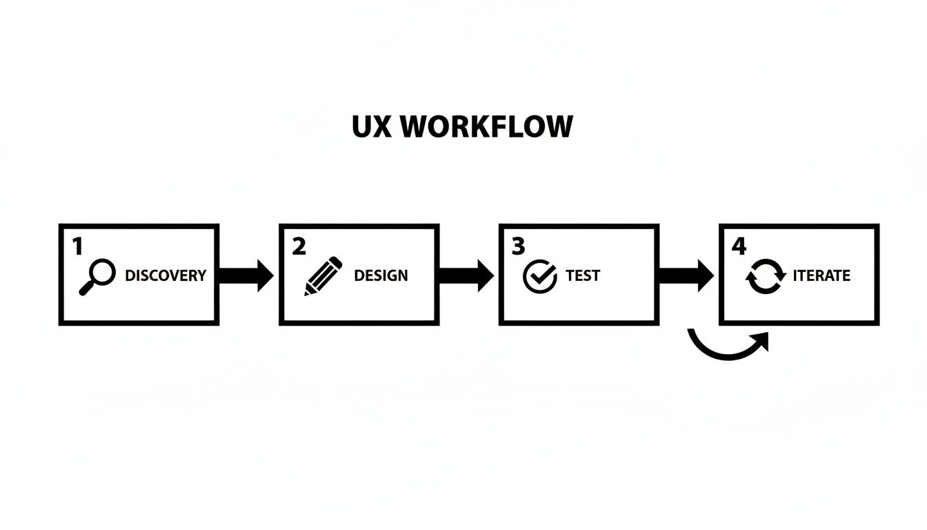
Discover, design, test, iterate. It is a loop, not a checklist you finish once.
Treating UX as a final coat of paint is a common mistake. It is the foundation of the app, and getting the structure right early saves you from expensive rework later.
The Four Stages of App UX Design
Here is how the four stages break down before we get into each one.
Phase | Core Activity | Primary Goal |
|---|---|---|
Discovery | Defining goals, understanding users | Establish a clear, shared vision for what the app needs to achieve and for whom. |
Design | Mapping flows, wireframing, UI patterns | Translate research into a tangible structure and visual interface for the app. |
Testing | Prototyping and usability testing | Validate design decisions with real users and find friction points before development. |
Iteration | Analyzing feedback and refining designs | Keep improving the experience based on real-world data and user insights. |
Each stage builds on the one before it.
You no longer need to be a trained designer to run this process well. Tools like CatDoes use AI to guide you through these steps, so you can stay focused on your users while the system handles the technical parts of design and development.
Defining Your App's Purpose and Audience
Every good app answers two questions: what problem are we solving, and who are we solving it for?
Jumping straight to feature lists is like building a house with no blueprint. You get something, but it is unstable and hard to use. This discovery phase is the foundation, and getting it right saves real pain later.
The goal is to move from a fuzzy idea to a sharp problem statement. That means understanding your users beyond their demographics: their daily frustrations, their goals, and what their day actually looks like.
Start With User Research

You do not need a big budget for this. You need to be curious and a bit scrappy.
Start with simple user personas, fictional characters who stand in for your ideal customers. Give them names, jobs, and the specific problems your app could solve. Then find real people who match and talk to them. A 15-minute conversation usually beats a week of guessing in a meeting room.
A few research methods to get going:
User interviews: ask open-ended questions about their experience and listen instead of pitching.
Surveys: a quick Google Form gets you feedback from a larger group. Keep it short.
Competitive analysis: look at other apps in your space. What works, and where are the gaps? The gaps are your opening.
If you have access to product managers or others who understand your market, pull them in early. Their read on user behavior sharpens the app's purpose.
Synthesize Your Findings Into a Problem Statement
Once you have gathered enough, boil it down into one clear problem statement. This is the sentence you point to when someone wants to add a feature that does not fit.
A well-defined problem statement is your best defense against feature creep. It keeps the whole team building what users actually want instead of a pile of nice-to-haves.
Compare a vague goal like "build a fitness app" to this: "Busy professionals need a quick way to fit exercise into unpredictable schedules, because traditional gym routines take too much time and offer too little flexibility." Now you know exactly who you are building for and what you are solving.
That clarity matters. If you want to pressure-test the idea itself, our guide on how to validate a business idea covers more. With the problem defined, you are ready to map the user's journey.
Structuring an Intuitive User Journey
Now you map the journey. This is where you build the app's skeleton, the logic and flow, long before you pick a single color. UX that feels effortless starts here.
Two pieces do most of the work: user flows and information architecture. Think of them as the route map and the city plan.
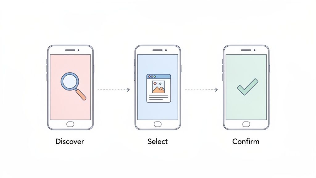
Charting the Course With User Flows

A user flow is a simple diagram of the exact path someone takes to get something done, whether that is signing up, buying something, or booking an appointment. The point is to make that path as direct as possible.
Mapping it forces you to check every screen and decision. Does the user have what they need at each step? Are there pointless obstacles? Forcing someone to create an account before they can browse is classic friction that a flow map exposes immediately.
A solid user flow includes:
Entry point: where the journey starts, like a push notification or the home screen.
Steps and actions: what the user actually does, like tapping a button or filling a form.
Decision points: the moments where a choice sends them down different paths.
Exit point: the screen that confirms the task is done.
Organizing Everything With Information Architecture
If user flows are the roads, information architecture (IA) is the city layout. It is how you organize, structure, and label content so people find what they need without thinking hard. Good IA answers the silent question every user has: where am I, and where can I go next?
A common pitfall is structuring an app around how your company is organized instead of how a user thinks. Build IA from the user's perspective and navigation feels natural.
For a retail app, that means grouping items into categories like "Men's," "Women's," and "Home Goods," not internal department names that mean nothing to a shopper.
Card sorting is a quick way to start. Write each feature and content type on a card, then ask a few potential users to group them in a way that makes sense to them. It is a cheap way to see how users actually think, so you can build a structure that fits.
This is another spot where CatDoes gives you a head start. Describe the main tasks your users need to do, and its AI agents help generate logical flows and a starting app structure.
Bringing Your App's Vision to Life Visually
With the blueprint in place, you can give the skeleton a visual skin. This is where abstract logic becomes an interface people can see and touch. Solve the big structural problems first, before getting lost in colors and fonts.
That is why we start with low-fidelity wireframes: simple black-and-white layouts focused on structure, placement, and flow. They show where the doors and windows go, not what color the walls are.
That simplicity is the point. It forces you to confront usability problems early, when changing them is cheap.
From Wireframes to High-Fidelity UI
Once the structure feels solid, move to high-fidelity mockups. This is where UI design takes over, bringing color, typography, imagery, and branding, and where the app develops its personality.
A few principles make an interface intuitive, not just attractive:
Visual hierarchy: guide the eye to what matters most through size, color, and placement.
Consistency: buttons, icons, and menus should behave the same way everywhere. Predictable apps feel trustworthy.
Accessibility: the app should work for everyone, which means real attention to color contrast, legible font sizes, and clear labels.
Good UI is communication, not decoration. Every color and button placement should make the journey smoother.
Keeping Up With Modern App Design
App design keeps moving. Right now you will see glassmorphism (those frosted, blurred layers), hyper-minimal layouts, well-built dark modes, and AI features woven into the experience. The common thread is performance: every visual choice gets weighed against its effect on load time.
If you want to go deeper on the visual side, see our guide on best GUI design practices. The point is that professional-grade visual design is now within reach for people who are not full-time designers.
Validating Your Design With Real Users
A design is a well-informed guess until a real person uses it. Prototyping and usability testing are where you trade assumptions for facts, before a single line of code gets written.
This stage is not about defending your choices. It is about watching where people get confused or stuck. Those friction points are the most useful thing you will get.
Creating Interactive Prototypes

First you need something people can interact with. A prototype is an interactive mockup that feels real enough to tap through, without the backend engineering. The goal is to simulate the core experience so people can complete key tasks the way they would in the finished app.
Prototypes range from clickable wireframes to high-fidelity mockups that look almost final. How polished you go depends on what you want to learn. Early on, a basic prototype validates the overall flow. Later, a more detailed one gets you feedback on visuals and small interactions.
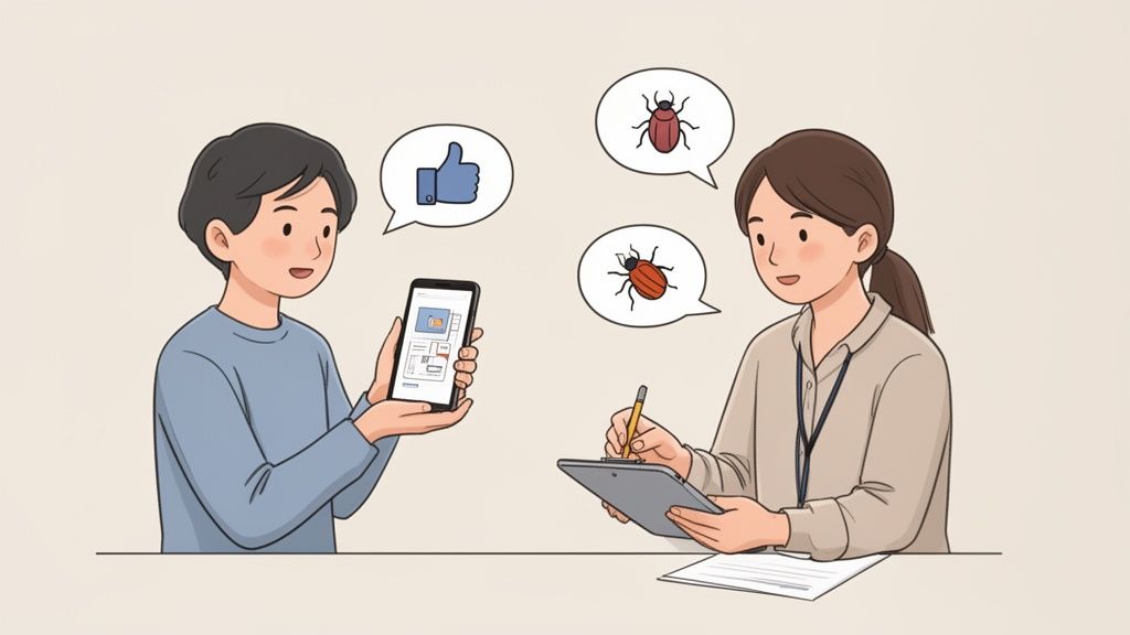
The best feedback comes from watching what people do, not what they say. Users will often call a process easy while visibly struggling through it.
Conducting Effective Usability Tests
You do not need a lab or a big budget. Testing with just five people who match your target audience uncovers roughly 85% of usability problems, according to the Nielsen Norman Group. Give each person a clear goal, like "find a pair of running shoes and add them to your cart," then watch and take notes.
A few things that make a session work:
Recruit the right people: participants should match your personas, or the feedback misleads you.
Do not lead the witness: skip "that button is easy to find, right?" Ask "what would you do next?" instead.
Ask them to think aloud: narration shows you their expectations and where reality breaks them.
This is where a tool like CatDoes makes life easier. You can generate an interactive preview and share it with a QR code, so anyone can test it on their own phone. For more, see our guide on prototyping and testing strategies.
Iterating Your Way to a Better App Experience
Launching is the starting line, not the finish. The real work begins when actual users get their hands on the app and the feedback starts coming in through reviews, support tickets, and analytics.
This is the loop where good apps become great: listen, understand, refine, repeat, based on real behavior instead of internal assumptions.
Translating Feedback Into Action
User feedback is messy. It is emotional, sometimes contradictory, and occasionally baffling. Your first job is to sort it into categories so patterns show up. A simple set of buckets works:
Critical bugs: crashes and broken features. These go to the top of the list every time.
Usability problems: people cannot find a button, navigation confuses them, or a workflow has too many steps.
Feature requests: the "it would be cool if" ideas. Weigh them against your roadmap.
General impressions: everything else, from praise to overall sentiment.
This structure moves you from constantly fighting fires to making deliberate decisions.
Prioritizing Your Next Move
Once feedback is organized, decide what to tackle. An impact-versus-effort matrix works well: plot each issue by how much it improves the experience against how much work it takes. The high-impact, low-effort items are your quick wins.
The goal is not to react to every piece of feedback. It is to find the changes that help the most users and line up with your business goals.
To keep the UI consistent as you change it, build a habit of reviewing screens after each update so small visual regressions do not pile up and quietly degrade the experience.
This whole loop gets simpler with a platform like CatDoes. You describe the changes you want in plain English and the AI agents implement them, so you can ship updates and respond to users faster.
Common Questions About App UX Design
Video: a short walkthrough of core app UX design principles.
A few questions come up again and again, whether you are a founder scoping a project or a designer new to mobile.
How Much Does Good App UX Design Cost?
It varies widely. Cost depends on your app's complexity, the scope, and who you hire. A freelancer and an agency will quote very differently. A simple app might run a few thousand dollars; a complex build can reach tens of thousands or more.
That model is shifting, though. AI platforms like CatDoes automate large parts of the design and development workflow, which cuts both time and cost and puts a professional experience within reach for founders on a tight budget.
What Is the Difference Between UI and UX Design?
UX (user experience) is the whole journey someone has with your app: the logic, the flow from screen to screen, and how easily they get something done. UX is the blueprint.
UI (user interface) is everything you see and touch: the colors, buttons, icons, and typography. It is the visual layer that brings the UX blueprint to life.
You need both. Brilliant UX gives you structure; brilliant UI gives you the look and feel. A beautiful app that confuses people fails as fast as a functional one that looks terrible.
How Can I Conduct Usability Testing With No Budget?
You do not need a lab or money to get useful feedback. The go-to approach is guerrilla testing: find people who fit your target profile, like friends, family, or colleagues, give them one clear task, and watch without guiding them.
Where to find volunteers for free:
Social networks: post in relevant Facebook groups or on LinkedIn.
Online communities: find subreddits or forums where your audience hangs out and ask politely.
Local meetups: if your app serves a local community, ask a few people for five minutes.
CatDoes makes this easy too: generate a QR code for your prototype and anyone can test it on their own phone.
Ready to turn your idea into a real app without the usual cost and complexity? CatDoes uses a multi-agent AI system to take you from a plain-English description to a working mobile app. Plan features, design the interface, and deploy, all in one conversational workflow.
Nafis Amiri
Co-Founder of CatDoes