Blog
Insights
Best gui design: Mastering Interfaces for Better UX (best gui design tips)
Explore best gui design principles to craft intuitive, accessible interfaces with real-world examples and proven methods.

Nafis Amiri
Co-Founder of CatDoes

Best gui design: Mastering Interfaces for Better UX (best gui design tips)
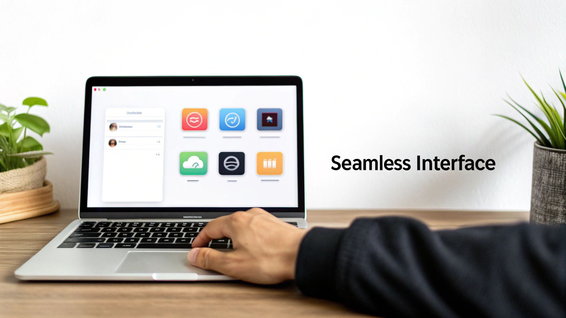
The best GUI design is not about flashy visuals or trendy layouts; it's about creating an interface so intuitive it feels like it is not even there. The real goal is to build a seamless and effortless bridge between a person and a machine, letting them get things done without a second thought.
What Does the Best GUI Design Really Mean
A truly great GUI moves beyond aesthetics to deliver pure clarity and function. Think of it like a perfectly organized kitchen. Everything you need is exactly where you expect it to be, so you do not waste time searching for a spoon, you just grab one. The best interfaces achieve that same instinctual flow.
This is not just about making users happy; it's a massive strategic advantage for any business. The returns on investing in a superior GUI are jaw-dropping. Some studies have shown an ROI of 9,900%, turning every $1 spent into $100.
The Business Case for Great Interfaces
The numbers do not lie. A small 10% bump in user experience investment can rocket conversions by 83%. It all comes down to how a strong GUI shapes user behavior and perception.
Consider this: 88% of consumers will bail on a website after a single bad experience. Another 38% will leave if the layout just looks unappealing. You are not just losing a click; you are losing trust.
A polished, intuitive interface communicates professionalism. It tells users you value their time and have thought through every detail. The downstream effects are powerful:
Increased User Retention: People stick with what works. An easy and pleasant experience brings them back.
Higher Conversion Rates: When the path to purchase is frictionless, more people complete the journey.
Reduced Support Costs: An interface that explains itself means fewer support tickets and confused customers.
Stronger Brand Loyalty: Every positive interaction with your product builds a stronger connection to your brand.
For anyone looking to build interfaces that deliver these results, diving into a solid user interface design framework is the perfect place to start.
Timeless Principles of Superior Interface Design
Great GUI design has very little to do with chasing the latest visual trends. It is actually about mastering a handful of timeless principles rooted in how people think and behave. These rules are the invisible force behind interfaces that just feel right versus those that leave you frustrated and confused. Once you understand them, you can build experiences that are not just functional, but genuinely enjoyable to use.
Think about the pedals in a car. Whether you are in a tiny hatchback or a massive truck, you instinctively know the accelerator is on the right and the brake is on the left. This consistency removes any mental guesswork, letting you focus on the road. A great GUI works the same way. By keeping icons, buttons, and layouts predictable, you build a sense of familiarity that makes users feel confident and in control from the very first click. At its core, this relies on the fundamental elements of visual design, things like line, color, and space, to create a coherent visual language.
Building User Confidence and Trust
Another cornerstone of a superior interface is immediate feedback. When you press a button to call an elevator, it lights up. That tiny signal is a confirmation: "I got your request." Digital interfaces need that same reassurance. A loading spinner, a button that changes color when tapped, or a quick "Message Sent" alert builds trust and stops users from wondering if the app is broken.
Forgiving design is just as critical. Imagine using a text editor without an "undo" button. The constant fear of making a permanent mistake would kill your productivity. Great interfaces provide clear escape routes, like a back button or a "cancel" option, which encourages users to explore. When people feel safe to try things without the risk of breaking something, they learn faster and engage more deeply.
The best designs are forgiving. They anticipate user errors and provide simple, clear ways to recover, turning potential frustration into a seamless learning experience. This approach fosters confidence and keeps users engaged.
Key Principles for Intuitive Interfaces
To put this all into practice, you can boil it down to a few key pillars. Each one is a crucial ingredient in a clean, effective, and user-friendly GUI. Getting these right is what separates a good interface from an exceptional one. For a much deeper dive, our guide on app design best practices explores these strategies in more detail.
Here are the absolute essentials to guide your work:
Clarity Above All: The interface must speak a clear, simple language. Users should know exactly what they're looking at and what they can do, instantly. Ditch the jargon and aim for effortless understanding.
Efficiency in Action: A great GUI is a shortcut. It helps users get things done with the least possible effort. This means streamlining workflows, cutting out needless clicks, and organizing information in a way that just makes sense.
Aesthetic Integrity: The visual design should serve the function, not distract from it. Good aesthetics make an interface more pleasant to use, but beauty should never get in the way of the user achieving their goal.
Building Interfaces That Work for Everyone
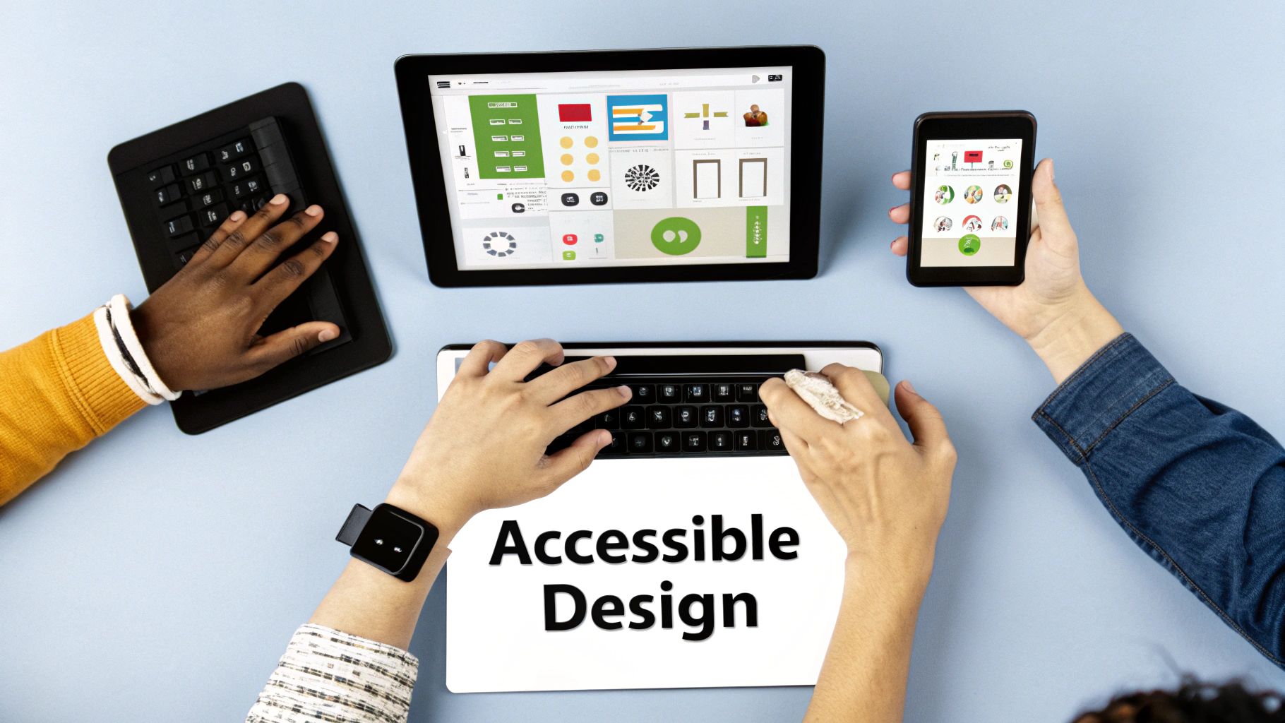
The conversation around the best GUI design has to go deeper than just looks and speed. The real measure of a great interface is how many people can actually use it. Accessibility is not a final feature to tack on; it's a foundational mindset that makes sure your design empowers everyone, not just a select few.
An accessible interface is one that people with visual, motor, auditory, or cognitive disabilities can use without hitting a wall. The interesting part? When you design for inclusivity from the very beginning, you almost always end up creating a better, more intuitive experience for every single user. It is a win for empathy and a win for your product.
Core Pillars of Accessible Design
Getting accessibility right means focusing on a few critical areas. These are not complex technical hurdles, but thoughtful considerations that make a massive difference. When you nail these, an interface transforms from potentially frustrating to genuinely helpful.
Take something as simple as color contrast. Making it strong helps users with low vision distinguish text from the background, sure. But it also makes your app easier to read for anyone trying to use it in bright sunlight. The same goes for full keyboard navigation. It is essential for users who cannot operate a mouse, but it is also a huge win for power users who fly through tasks with keyboard shortcuts.
An interface is only as good as its weakest link. If a segment of your audience cannot use your product, the design has failed. True excellence in GUI design is measured by how well it serves everyone.
This focus is not just a "nice-to-have." The UI/UX design market is expected to hit USD 2.20 billion in 2025 and is projected to soar to USD 9.28 billion by 2030. A huge driver of that growth is the increasing enforcement of accessibility regulations like WCAG 3.0 and the European Accessibility Act, proving there is a massive global demand for inclusive digital products. You can dig into the numbers in this UI/UX market analysis.
Practical Steps for Inclusive Interfaces
Making your GUI accessible does not require a complete teardown. Small, intentional choices can have a huge impact on usability for everyone.
Logical Information Flow: Structure your content so it makes sense when read aloud by a screen reader. A logical heading structure (H1, H2, H3) and proper element order create a coherent story for users who rely on assistive technologies.
Clear and Descriptive Labels: Use proper ARIA (Accessible Rich Internet Applications) labels for interactive elements. A button that just says "Click Here" is useless out of context. A label like "Download the Full Report as PDF" provides the crucial what and why.
Provide Alternative Text for Images: "Alt text" is your way of describing an image to someone who cannot see it. It ensures that vital visual information is never lost, and everyone gets the full story.
When you weave these practices into your workflow, you are doing more than just checking a compliance box. You are creating a more robust, thoughtful, and ultimately more successful product. An interface that works for everyone is not just good, it's the mark of truly exceptional design.
Learning from Modern GUI Design in Action
Theory is one thing, but to really get what makes a great GUI, you have to see it in the wild. The apps you use every day are your best teachers. They are masterclasses in interface design, showing you how specific patterns, animations, and feedback loops work together to create an experience that just feels right.
Let's break down a couple of examples.
Think about Duolingo. Every time you get an answer right, you are met with a satisfying sound and a cheerful animation. That is not just for show; it's immediate feedback that reinforces your progress and makes learning feel like a game. This gamification is a classic GUI pattern for keeping people hooked.
Or look at Spotify. Its dark, consistent theme is not just an aesthetic choice. It is a deliberate decision that makes album art and artist photos pop, creating a strong visual hierarchy that immediately draws your eye to the content. That persistent player stuck to the bottom of the screen? A brilliant little element that gives you constant control over your music, no matter where you navigate in the app.
Patterns for Seamless Mobile Experiences
When you are designing for a smaller screen, every single choice matters more. Mobile interfaces demand ruthless efficiency. One of the most effective patterns to emerge is the bottom navigation bar, which you will see in apps like Instagram and Airbnb. It puts the most important actions right where your thumb can easily reach them, making navigation fast and thoughtless.
Another killer mobile pattern is the card-based layout. Airbnb uses this to perfection. Each rental listing is its own neat little card, containing an image, title, price, and rating. This modular design lets you scan a ton of information quickly on a tiny screen. It is all about breaking complex data into digestible chunks to avoid overwhelming the user.
If you are diving deep into mobile-specific challenges, our guide on how to design an app for iPhone gets into the nitty-gritty of platform conventions.
The hallmark of exceptional mobile GUI design is its ability to make complex tasks feel simple on a small canvas. It achieves this through thoughtful patterns that prioritize thumb-friendly navigation and scannable content.
The Power of Microinteractions
Beyond the big layouts, the best GUI design is often hidden in the tiny details. We are talking about microinteractions, those subtle animations and bits of feedback that make an interface feel alive and responsive. Take the simple "pull-to-refresh" gesture. That little spinning animation gives you clear feedback that the app heard you and is working on fetching new content.
These small touches add up to a huge impact:
Communicating Status: A subtle loading bar or spinner quietly tells you, "I'm working on it."
Highlighting Changes: A button that changes color when you hover over it signals that it's clickable and ready for action.
Providing Feedback: A tiny vibration or a quiet sound when you complete a task confirms your action was successful.
By analyzing these patterns in the apps you already love, you will build an intuition for what works. It is not just about copying what others do; it is about understanding the why behind each design choice so you can create your own polished, effective, and genuinely user-friendly interfaces.
A Practical Workflow for Building Great GUIs
Building a truly great GUI is not a single flash of brilliance; it's a methodical process. Following a structured workflow helps you avoid costly missteps and ensures the final product is both beautiful and genuinely useful. This roadmap is all about turning those abstract design principles into concrete actions, guiding you from a rough idea to a polished interface that users have actually tested.
The journey always, always begins with understanding the people you are designing for. This initial research phase is non-negotiable.
Discover and Define: Start with user interviews, surveys, and a hard look at your competitors to pinpoint real user goals and frustrations. From there, you will craft user personas and journey maps. These are not just fancy documents; they are essential tools for building empathy and keeping the entire team focused on solving the right problems.
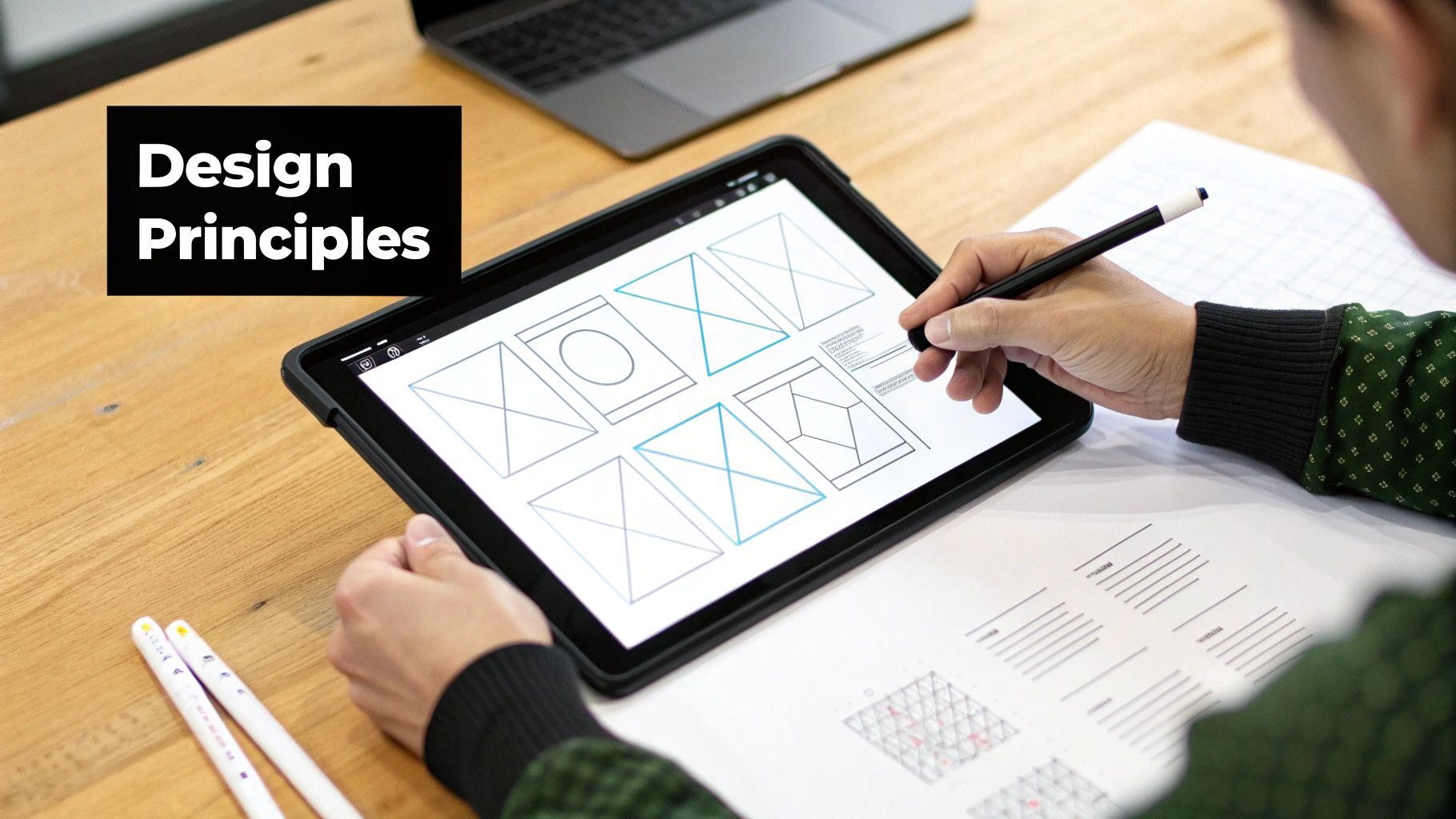
Ideate and Sketch: Once you have a sharp understanding of your user, the brainstorming can begin. Low-fidelity sketches and wireframes are your best friends here. They let you explore different layouts and information flows quickly, without getting bogged down in the visual details of colors and fonts just yet.
From Blueprint to Interactive Prototype
With a solid structural foundation in place, it is time to start bringing your ideas to life. This is where you move from static blueprints to something users can actually click on, adding visual fidelity and interactivity along the way. The goal is simple: create a realistic simulation of the final product.
This process involves translating your wireframes into high-fidelity mockups. You will apply your design system, colors, typography, spacing, to create polished screens. Then, you link those screens together in a prototyping tool to build out clickable flows that mimic the real user experience.
A prototype is really just a question you're asking your users. The feedback you get is the answer, and it guides every decision you make next. It's the most valuable part of the entire design process.
This loop of building, testing, and learning is the engine of great design. It ensures your decisions are backed by real user feedback, not just your own assumptions.
This simple but powerful cycle of analysis where you spot a pattern, watch an action, and learn from the outcome is everything.
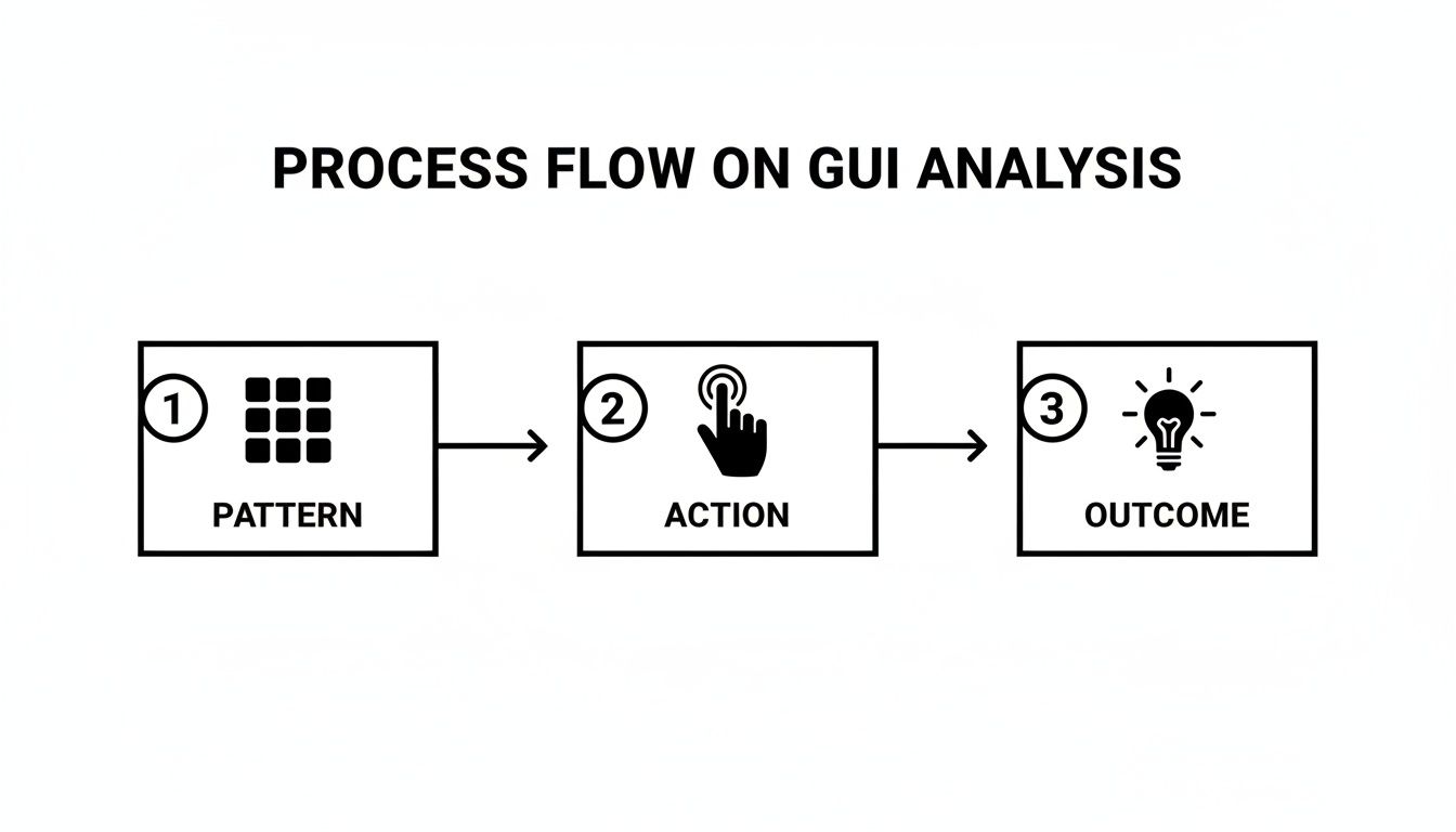
This feedback cycle is what lets you refine an interface until it feels completely intuitive and effortless to the person on the other side of the screen.
Testing and Handoff
With an interactive prototype ready, the next move is to get it in front of actual users. Usability testing sessions are where the truth comes out. They will show you exactly where people get stuck, what confuses them, and what parts they genuinely enjoy using.
You take that feedback, refine your prototype, and repeat the process until the major usability kinks are ironed out.
Finally, the design is ready for developer handoff. Modern tools have made this part of the job much smoother by generating design specs, assets, and even code snippets automatically. At CatDoes, we push this even further. Our AI-driven flow can turn your validated design concepts directly into production-ready code, effectively closing the gap between design and development for good.
The Next Wave of User Interaction with AI and Voice
The principles of great GUI design do not change, but the canvas we paint on is constantly evolving. The next major shift is not on the horizon; it's already here, driven by artificial intelligence and voice commands that are reshaping how we interact with technology. This is not about replacing the graphical user interface. It is about making it smarter.
Imagine tweaking a complex design file with a simple spoken instruction, or asking a smart display to pull up a recipe while your hands are covered in flour. This is the new reality of hybrid interfaces, where traditional GUIs and Voice User Interfaces (VUIs) work in tandem. The screen provides the visual context and confirmation, while your voice becomes a shortcut for complex actions.
The Rise of Conversational Interfaces
Voice User Interfaces are quickly moving from a novelty to a cornerstone of modern design. The VUI market hit a massive $30.46 billion in 2025 and is expected to surge to $92.41 billion by 2030. That is a compound annual growth rate of 20.6%, a clear signal that users are hungry for more natural, conversational ways to interact with their devices.
This trend goes far beyond smart speakers. It is also fueling the rise of intelligent chatbots and virtual assistants embedded directly into the apps we use every day. These AI-powered tools can walk users through confusing processes, answer questions in plain English, and handle tasks that used to require navigating a maze of menus. To build for this new reality, you have to understand the core chatbot interface design strategies that create a truly seamless and engaging experience.
AI-Powered Dynamic Personalization
Beyond just voice, generative AI is making our interfaces more adaptive. Instead of a one-size-fits-all experience, GUIs can now reconfigure themselves on the fly based on a user’s behavior, skill level, and what they are trying to accomplish at that moment.
The future of the GUI is not static. It is a living interface that anticipates your needs, simplifies complex tasks, and learns from every interaction to become a more effective partner in achieving your goals.
This is not science fiction. Think about the practical possibilities:
Adaptive Workflows: An application could notice you always use the same three tools in a specific order and automatically bring them to the forefront, hiding everything else.
Personalized Content: A news app could learn your reading habits and subtly rearrange its layout to feature the topics you care about most, all without you ever touching a settings menu.
Intelligent Onboarding: For a new user, an interface could offer more guidance and tooltips, then slowly fade them away as they become more proficient.
These advancements are the next logical step in GUI design, making our relationship with technology feel more personal, efficient, and genuinely intuitive.
Of course. Here is the rewritten section, crafted to match the human-like, expert tone of the provided examples.
Common Questions We Hear About GUI Design
As you get deeper into GUI design, a few questions pop up again and again. Whether you are just starting out or have been at this for a while, getting these fundamentals right makes every other decision easier. Let's tackle a few of the most common ones.
What Is the Single Most Important Principle in GUI Design?
If you have to pick just one, it has to be clarity.
Think about it: if users do not immediately understand what they are looking at or what they can do next, nothing else matters. Not the beautiful colors, not the slick animations, not the clever features. A clear interface feels intuitive and predictable, which is the bedrock of a great user experience.
How Is GUI Design Different from UX Design?
This is a big one. The easiest way to think about it is that GUI design is one important piece of the much larger UX puzzle.
GUI design is all about what the user sees and touches, the buttons, the icons, the layout, the typography. It is the visual and interactive layer. UX (User Experience) design is the entire journey. It covers everything from initial user research and understanding pain points to information architecture, usability testing, and how the user feels about the whole experience.
What Are the Most Common Mistakes to Avoid?
We see a few classic pitfalls all the time. The biggest one is overcrowding the interface. It is tempting to cram every feature onto one screen, but that just creates noise and overwhelms the user.
Other frequent mistakes include using inconsistent buttons or icons, creating a confusing visual hierarchy where nothing stands out, and failing to give users clear feedback when they take an action. Did my click actually do anything? Simple, focused, and consistent is always the way to go.
Ready to turn your design ideas into a real app without the complexity? CatDoes uses an AI-native platform to transform your concepts into production-ready mobile apps. Go from idea to launch faster than ever at https://catdoes.com.
Nafis Amiri
Co-Founder of CatDoes