Blog
Tutorials
How to Design an App for iPhone 2026
Learn how to design an app for iPhone with our comprehensive guide. We cover everything from initial ideation to App Store submission and developer handoff.

Nafis Amiri
Co-Founder of CatDoes

Designing an app for the iPhone is about much more than making something that looks good. It is a full process that starts with a clear strategy, digs into what your users actually need, and ends with a visual blueprint that feels at home on an Apple device. This guide walks through all of it, from early market research and user flows to pixel-perfect mockups that follow Apple's design language.
Table of Contents
Building Your App's Strategic Foundation
Working with Apple's Human Interface Guidelines
Translating Ideas Into Visual Designs
Testing and Refining With Interactive Prototypes
Weaving in Accessibility and Performance
Preparing for Handoff and the App Store
Frequently Asked Questions
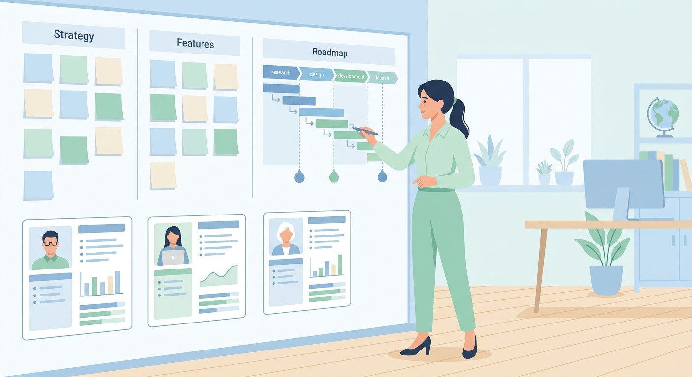
Building Your App's Strategic Foundation
Before you pick a color palette or design a single icon, the most important work has to happen. A great iPhone app is built on a solid strategic foundation, not just a good idea. This first phase is about nailing down your purpose, understanding who you are building for, and mapping out a clear path forward. Skip this groundwork and you risk building an app that looks polished but doesn't solve a real problem for anyone.
The first step is to get clear on your app's core purpose. What specific problem does it solve? Who is it for? Answering these questions with real clarity is your best defense against feature creep, and it keeps your design focused. A fitness app's goal isn't "to help people work out." A stronger goal is "to give busy professionals effective 15-minute workouts they can do at home with no equipment." That level of specificity guides every design decision you make.
This early work moves you from initial research to defining user personas and mapping their journeys through your app. Every design choice should be rooted in a deep understanding of the market and, above all, the person using the app.
Define Your Target Audience and User Personas
You can't design an app for "everyone." You need to know exactly who you are building for, and that is where user personas come in.
Personas are detailed, fictional characters that represent the different types of people who will use your app. They go beyond simple demographics to capture goals, motivations, and frustrations.
Instead of targeting a vague group like "millennials," you might create a persona like "Alex, a 28-year-old marketing manager who struggles to find time for grocery shopping and wants a quick, healthy meal delivery option." A profile like this pushes you to empathize with your users and design features that genuinely make their lives easier.
Detailed user personas are the difference between designing for a vague concept and designing for a real person. They force you to think about specific needs and motivations, which leads to a more intuitive and valuable product.
Conduct Thorough Market Research
Understanding the competitive landscape is essential. When you design an iOS app, you are stepping into Apple's ecosystem, which spans more than 1.8 billion active iPhones and roughly 1.8 million apps on the App Store. With thousands of new apps submitted every week, you have to find a way to stand out.
Staying current matters too. As of 2026, the latest release is iOS 26, which Apple shipped in September 2025 with its new "Liquid Glass" design language, the biggest visual refresh since iOS 7. Apple requires recent SDKs for new App Store submissions, so building against the current iOS version isn't optional.
Your market research should focus on a few key questions:
Who are your main competitors? Download their apps, use them, and read their reviews. Figure out what they do well and, more importantly, where they fall short.
What is your unique value proposition? What makes your app different or better than what's already out there? Be specific.
Is there a gap in the market? Look for underserved niches or unsolved problems your app can address.
This research isn't a one-and-done task. It is an ongoing process that helps you adapt as the market changes. A clear purpose, detailed personas, and solid research give you a strategic blueprint that guides the entire design process.
Working with Apple's Human Interface Guidelines
If you want your iPhone app to succeed, it has to feel like an iPhone app. That sounds simple, but it is where many good ideas stumble. Apple gives you a playbook for this: the Human Interface Guidelines (HIG). It is less a rigid rulebook and more a design philosophy for creating experiences that are intuitive and instantly familiar.

Think of the HIG as the shared language between your app and every iPhone user. When your design speaks that language, people don't have to learn a new system. They already know how to navigate, which gestures to use, and what visual cues mean because they learned them in Mail, Safari, and a hundred other apps. Ignoring the HIG creates friction and makes your app feel out of place.
Following the guidelines isn't about limiting your creativity. It is about building on a foundation of trust and usability, which frees you up to innovate where it counts.
Core Principles That Guide iOS Design
The HIG is built on a handful of core ideas that shape everything you see on an iPhone. Once you understand them, you will naturally make smarter design choices that feel right to iOS users.
The two big ones are deference and clarity. Deference means your UI should never steal attention from the user's content. It should be subtle, supportive, and use plenty of negative space to let content breathe. Clarity is exactly what it sounds like: text must be readable, icons must be sharp and understandable, and every function should be unambiguous.
Apple's philosophy is about getting out of the user's way. Your interface should feel like a natural extension of the phone, helping people get things done without drawing attention to itself.
Beyond those, a few more principles are worth keeping in mind:
Consistency: Stick with system-provided buttons, icons, and text styles. This makes your app predictable and easy to pick up.
User Control: The user is in charge, not the app. Actions should be reversible, and the app should give clear feedback for every tap and swipe.
Feedback: Every action deserves a small acknowledgment, whether it's a button highlighting on tap or a smooth animation. It tells the user the app registered what they did.
Here is a quick summary of the core principles and how they translate into real design decisions.
Key iOS Human Interface Guidelines at a Glance
HIG Principle | Core Concept | Practical Application Example |
|---|---|---|
Clarity | Text is legible, icons are precise, and functions are unambiguous. | Using SF Pro, Apple's system font, ensures readability. Icons stay simple and universally understood, like a trash can for deleting. |
Deference | The UI helps users interact with content but never competes with it. | A photo editing app uses translucent toolbars and minimal chrome so the user's photo stays the focus. |
Depth | Visual layers and realistic motion create hierarchy and context. | A modal view slides up from the bottom of the screen, signaling it's a temporary layer on top of the main view. |
Consistency | System-provided elements and patterns make the app familiar and predictable. | An app uses a standard iOS tab bar for top-level navigation, just like the App Store or Music apps. |
User Control | Users, not the app, are in control. Actions are reversible and feedback is clear. | Showing a confirmation alert before a user permanently deletes an item gives them a chance to cancel. |
These principles directly influence the common UI patterns and hardware considerations you will work with every day.
Navigating Common iOS UI Patterns
When you design for the iPhone, you don't need to reinvent basic navigation. Billions of people already know how to get around. The most common pattern is the tab bar, anchored to the bottom of the screen. It works well for apps with a flat structure, letting users jump between main sections instantly.
For apps with a deeper, more layered structure, the navigation bar at the top is the standard. It labels the current screen and includes a back button, so users never feel lost. You see this everywhere, from the Settings app to your photo albums.
Often the best approach is to combine them. A podcast app might use a tab bar for "Library," "Browse," and "Search," then use a navigation bar inside the library to drill from shows to seasons to individual episodes.
Respecting the Device and System Features
A great iPhone app feels like it was born on the device, which means respecting the hardware and leaning into its features. That starts with the safe areas, the space at the top and bottom of the screen. Make sure interactive elements aren't hidden behind the notch or the home indicator. It's a common mistake that instantly makes an app feel broken.
Modern iPhones also have the Dynamic Island, the interactive zone at the top that shows alerts and live activities. Even if you don't build a custom integration right away, your design cannot interfere with its space or function.
Finally, gestures are central to iOS. Users instinctively swipe from the left edge to go back, pull down to refresh a list, and pinch to zoom on an image. Building these standard gestures in from the start makes your app feel responsive, fluid, and genuinely native.
Translating Ideas Into Visual Designs
With your strategy locked in and a healthy respect for the HIG, it's time to give your app a face. This is where abstract ideas about user flows and features take shape, evolving from rough sketches into polished, pixel-perfect screens.

The process has a natural rhythm: from low-fidelity wireframes to high-fidelity mockups. You build the functional skeleton before you put the skin on. Jumping straight into colors and fonts without a structural blueprint is a common mistake. It's like painting the walls before the framing is up, and you will end up backtracking to fix foundational problems.
Starting with Low-Fidelity Wireframes
Think of wireframes as the architectural blueprints for your app. They are simple, black-and-white layouts focused purely on structure, hierarchy, and placement. Their only job is to map where key elements like buttons, images, and text live on each screen, and how a user moves from one to the next.
By stripping away visual noise such as color, typography, and branding, wireframes force you to confront the user experience directly. Do the layouts make sense? Is the navigation obvious? Can someone accomplish their goal without getting lost? Wireframing gives you fast answers to these questions.
A wireframe for a recipe app's home screen might just be a series of boxes: a large one for a featured recipe, smaller ones for categories, and a navigation bar pinned to the bottom. It answers the "what" and "where," not the "how it looks."
Wireframing is about solving usability problems, not aesthetic ones. It's the fastest, cheapest way to validate your app's structure and flow before you commit to a full visual design.
Tools like Balsamiq, or even a pen and paper, are perfect for this stage. The goal is speed and iteration, not perfection. You should be able to sketch a dozen ideas in an afternoon, get feedback, and refine your layouts without getting bogged down in details.
Crafting High-Fidelity Mockups
Once your wireframes feel solid and the user flow is intuitive, it's time to move to high-fidelity mockups. This is where your app's personality takes shape. Using a design tool like Figma, Sketch, or Adobe XD, you transform those bare-bones blueprints into detailed, full-color designs that look and feel like the finished product.

This stage is about making the key decisions that define your app's visual identity.
Color Palette: Colors aren't just decoration; they guide attention and evoke emotion. A fintech app might use trustworthy blues and greens, while a meditation app leans on calming, earthy tones. Your choices should feel authentic to your brand.
Typography: On an iPhone, readability is everything. Apple's system font, SF Pro, is a safe bet because it's designed for maximum clarity on iOS. If you choose a custom font, make sure it stays legible at various sizes and weights.
UI Elements: Here you design the buttons, icons, forms, and other pieces users interact with. Every element should feel consistent with your overall style and follow iOS conventions so users instantly know what to do.
Building these mockups is a vital part of learning how to design an app for iPhone, and it creates a clear visual target for the development phase. It's also your last good chance to spot design inconsistencies. For a deeper look at creating interfaces that connect with users, see our guide on app design best practices.
The goal is a complete set of screens covering every state of your app, from onboarding and the main dashboard to settings pages and error messages. This comprehensive visual guide means that when it's time to build, there are no ambiguities about how the app should look or behave.
Testing and Refining With Interactive Prototypes
A set of beautiful, high-fidelity mockups is a big step forward, but it's still a collection of pictures. People don't interact with pictures; they tap, swipe, and navigate through a living experience. Interactive prototyping turns your static screens into a simulation that shows how your app will actually feel and function.

This is the bridge between design and development. By building a clickable prototype, you can catch usability problems, validate your user flows, and get honest feedback long before a single line of code is written. It's the fastest way to answer the most important question: does this actually work for a real person?
Building Your First Clickable Prototype
Getting a prototype running is less technical than it sounds. Modern tools like Figma let you stitch your mockups together with a few clicks. The process revolves around creating "hotspots" on your designs, like buttons or list items, and defining what happens when a user taps them.
You can link the "Sign Up" button on your welcome screen directly to the "Create Account" screen, connect tab bar icons to their pages, and simulate classic iOS animations like a modal view sliding up from the bottom.
You don't need to make every element interactive. Instead, focus on the primary user flows you mapped out earlier.
The Onboarding Journey: Can a brand-new user sign up and immediately grasp the app's value?
The Core Task: Can someone complete the main action your app is built for, like booking a reservation or publishing a post?
Basic Navigation: Can users move between the main sections of your app without getting lost?
By concentrating on these critical paths, you build a prototype that's solid enough for meaningful testing without getting stuck in the weeds.
Running User Tests That Actually Work
With your prototype ready, it's time to put it in front of real people. The goal isn't to collect compliments on your color palette; it's to find the friction. You want to see where people get stuck, what confuses them, and what doesn't meet their expectations.
Here's a simple way to run a productive testing session:
Give them a mission, not instructions. Instead of "Tap the profile icon, then tap settings," frame it as a real goal: "Imagine you want to change your email notifications. Show me how you'd do that."
Observe and stay quiet. Your job is to be a fly on the wall. Let people think out loud so you can hear their reasoning. The urge to jump in and help is strong, so resist it.
Ask open-ended questions afterward. Once they've finished, ask things like "What did you expect to happen when you tapped that?" or "Was anything on that screen unclear?"
This feedback is valuable. Discovering that 7 out of 10 testers couldn't find the checkout button is a critical insight, and it's far cheaper to fix in a Figma file than in a live app.
Iterate, Refine, and Repeat
The feedback you gather is worthless if you don't act on it. After a few sessions, consolidate your notes and look for patterns. If several people stumbled in the same spot, that's a clear sign the design needs another look.
Prototyping and testing create a powerful feedback loop. You build a prototype to test an assumption, gather insights that challenge it, and iterate to make the design better. This cycle is the heart of user-centered design.
Beyond the functional flow, make sure the visuals hold up. Reviewing your screens carefully for inconsistencies, spacing issues, and broken states helps you validate design fidelity early. Refining your prototype based on real human interaction is what turns a good design into a great one, so the final app isn't just attractive but genuinely intuitive.
Weaving in Accessibility and Performance
A great iPhone app isn't only about sharp visuals and a clever user flow. It's about creating an experience that feels effortless for everyone, whatever their abilities, and runs smoothly on the device in their hand.

Too often, accessibility and performance are treated as a final checklist item to bolt on at the end. That's a mistake. Considering them from day one prevents painful redesigns and shows real commitment to your users. An inclusive, responsive app doesn't just work better; it builds loyalty in a crowded App Store. Building modern considerations like AI features and privacy in from the ground up is increasingly what separates the apps that succeed from the ones that don't.
Designing for Every User
Accessibility means designing your app so that people with disabilities can use it. It is not an edge case. Apple provides powerful assistive technologies, and your job as a designer is to make sure your app works well with them.
The goal is to remove barriers. A few foundational practices make a big difference in how you design an app for the iPhone.
Color Contrast: Make sure text and important interface elements stand out clearly from their background. Use a contrast checker so your colors meet at least WCAG AA standards.
Dynamic Type Support: Your design must respect a user's choice to increase the system font size. Use auto-layout and scalable fonts so your interface reflows gracefully instead of cutting off or overlapping text.
VoiceOver Compatibility: Consider how your app works with Apple's screen reader. Every button, icon, and interactive element needs a clear, descriptive label that VoiceOver can read aloud, so a user can navigate the entire app using audio alone.
Designing for accessibility isn't a niche requirement; it's a universal design principle. An app that's easier for someone with a disability to use is almost always easier for everyone to use.
Optimizing for Peak Performance
Performance is about how the app feels. Is it snappy and responsive, or does it feel sluggish and drain the battery? Your design choices directly affect technical performance, and a beautiful, media-rich design can quickly become frustrating if it isn't optimized.
Here are a few areas where design decisions have a real impact on speed and battery life.
Design Area | Optimization Goal | Practical Example |
|---|---|---|
Image Assets | Reduce file size without losing quality. | Export images in modern formats like WebP or HEIC. They compress far better than older PNGs or JPGs. |
Animations | Create fluid, efficient motion. | Keep animations simple and physics-based. Avoid complex calculations that tax the processor, and stick to transitions that feel native to iOS. |
Battery Life | Minimize resource consumption. | Avoid designs that demand constant background updates or frequent network calls. These are notorious battery drains. |
Building accessibility and performance into your design process is non-negotiable. It shows respect for your users' time, abilities, and devices, and it's what separates good apps from genuinely exceptional ones.
Preparing for Handoff and the App Store
You're in the final stretch. Your design is polished, the flows feel right, and now it's time to package everything for two very different audiences: the developers who will build it and the users who will find it on the App Store.

Getting this part right is critical. A messy handoff can inject bugs and misunderstandings into the final product, and weak App Store assets can bury your launch before it starts. The goal is to translate your design vision cleanly into code and a strong first impression.
Crafting a Compelling App Store Presence
Think of your App Store page as your app's digital storefront. You get one shot at a first impression, and users form an opinion in seconds. You have to grab them quickly.
It starts with a memorable app icon. It needs to be simple, instantly recognizable, and sharp everywhere, from the store listing to a crowded home screen.
Next come your screenshots and preview videos. These aren't random screen captures; they should tell a story. Your goal is to showcase the app's core value and walk a potential user through the experience they're about to have.
Highlight Key Features: Show what makes your app unique. What problem does it solve better than anything else?
Use Descriptive Captions: Add short, punchy text overlays to give context and spell out the benefits.
Create an Engaging Preview Video: A quick 15-30 second video showing the app in action is often more persuasive than static images.
Your App Store assets are your most powerful marketing tool. Treat them with the same care you gave the app itself. Their job is to turn a casual browser into an excited new user.
Assembling the Perfect Developer Handoff Package
Handing your designs to the engineering team should be a clean, organized process, not a chaotic dump of files. The goal is to leave zero room for guesswork. A great handoff package is the single source of truth for how the app should look, feel, and function.
Your package needs a few non-negotiable components. First, a detailed style guide documenting your color palette (with hex codes), typography rules (font, size, weight), and your complete icon set. This is your insurance policy for visual consistency.
You also need every asset in the right format. Developers need icons, images, and logos exported at multiple resolutions (@1x, @2x, @3x) to look crisp on different iPhone screens. Modern tools like Figma make this export almost trivial.
Finally, static mockups fall short for complex animations or transitions. Don't leave them to interpretation. Provide detailed specs or, better yet, a short video prototype showing exactly how an interaction should feel. For a complete overview of taking your app from concept to reality, our guide on how to launch an app is a helpful next read. A great product also needs a great launch plan, so a thoughtful marketing strategy can be the key to helping your app find its audience.
Frequently Asked Questions
A few common questions that come up when teams start designing an iPhone app.
What Are the Most Important Tools for Designing an iPhone App?
Your core toolkit for serious iPhone app design revolves around a solid vector design program. Most professionals work in tools like Figma, Sketch, or Adobe XD for wireframes and high-fidelity mockups.
How Much Does It Cost to Design an iPhone App?
There's no single price tag, since it comes down to the app's complexity and the designer's experience. A straightforward app with a few simple screens might land in the low thousands of dollars.
For a more complex application with detailed user flows, custom animations, and multiple features, expect the design phase alone to cost anywhere from $20,000 to $50,000, and sometimes more. That budget typically covers everything from initial research and wireframing through final UI/UX design and prototyping.
What Is the Biggest Mistake to Avoid in iPhone App Design?
The single biggest mistake is ignoring Apple's Human Interface Guidelines. It happens often: teams build an app that looks and feels like it was designed for a different operating system, which creates a jarring, confusing experience.
Following iOS conventions for navigation, gestures, and UI elements isn't about limiting creativity. It's about making your app feel intuitive and familiar from the first tap, which is critical for adoption and keeping people happy.
Ready to bring your iPhone app idea to life without the complexity? CatDoes is an AI-native platform that turns your concepts into production-ready apps. Let our AI agents handle the design, development, and release process for you. Start building your app for free today at catdoes.com.
Nafis Amiri
Co-Founder of CatDoes