Blog
Insights
7 App Design Best Practices for 2026
Discover 7 essential app design best practices for 2026. Covers touch-first UI, platform guidelines, dark mode, accessibility, and performance optimization.

Nafis Amiri
Co-Founder of CatDoes

The difference between an app that gets deleted after one session and one that becomes a daily habit often comes down to design. Users form a first impression in roughly 50 milliseconds, and about 94% of it is design-driven. With 72% of users abandoning apps within 30 days and mobile traffic accounting for over 60% of all web traffic, getting your app design right isn't optional. Here are seven app design best practices that separate sticky apps from forgettable ones in 2026.
Table of Contents
TL;DR
1. Design for Touch First
2. Follow Platform Design Guidelines
3. Build Accessibility In from Day One
4. Support Dark Mode
5. Optimize for Speed
6. Create Clear Visual Hierarchy
7. Prototype and Test Before You Build
App Design Best Practices at a Glance
FAQ
TL;DR
Great app design in 2026 means building for touch first (44pt minimum targets), following platform guidelines (Apple HIG with Liquid Glass, Material Design 3 Expressive), making accessibility non-negotiable (the EU Accessibility Act is now enforced), supporting dark mode (82% of users prefer it), optimizing load times (53% abandon after 3 seconds), using clear visual hierarchy, and testing with real users early (AI tools now turn prompts into working prototypes in minutes). Each practice below is backed by current data and specific implementation guidance.
1. Design for Touch First
Your users interact with your app through their fingers, not a mouse cursor. This difference should drive every layout and interaction decision. Touch targets that are too small cause frustration. Research shows that targets smaller than 44×44 pixels have error rates 3× higher than properly sized ones.
Each platform sets specific minimum requirements:
Apple iOS: 44×44 points (approximately 59px)
Google Material Design: 48×48 dp
WCAG 2.2 Level AA: 24×24 CSS pixels minimum
Apple visionOS: 60×60 points, the largest recommendation, because spatial input is less precise
Beyond tap targets, gesture navigation is replacing button-heavy interfaces. Swipes, long-presses, and pull-to-refresh feel more natural on mobile. But gestures must always be shortcuts, never requirements. Every gesture needs a visible alternative for users who can't perform complex motions. For more on mobile interaction patterns, this guide to UX design for apps covers the fundamentals.
2. Follow Platform Design Guidelines
Users have muscle memory. An iOS user expects swipe-to-go-back. An Android user expects a bottom navigation bar. Fighting these expectations creates friction that costs you retention. Following platform guidelines makes your app feel native and familiar.
Apple Human Interface Guidelines
Apple's HIG is the definitive resource for iOS, iPadOS, macOS, watchOS, and visionOS design. In mid-2025, Apple introduced Liquid Glass, its most significant visual redesign since iOS 7 in 2013. This translucent material with refraction and reflection effects extends across all Apple platforms simultaneously, the first time Apple has unified its design language this way.
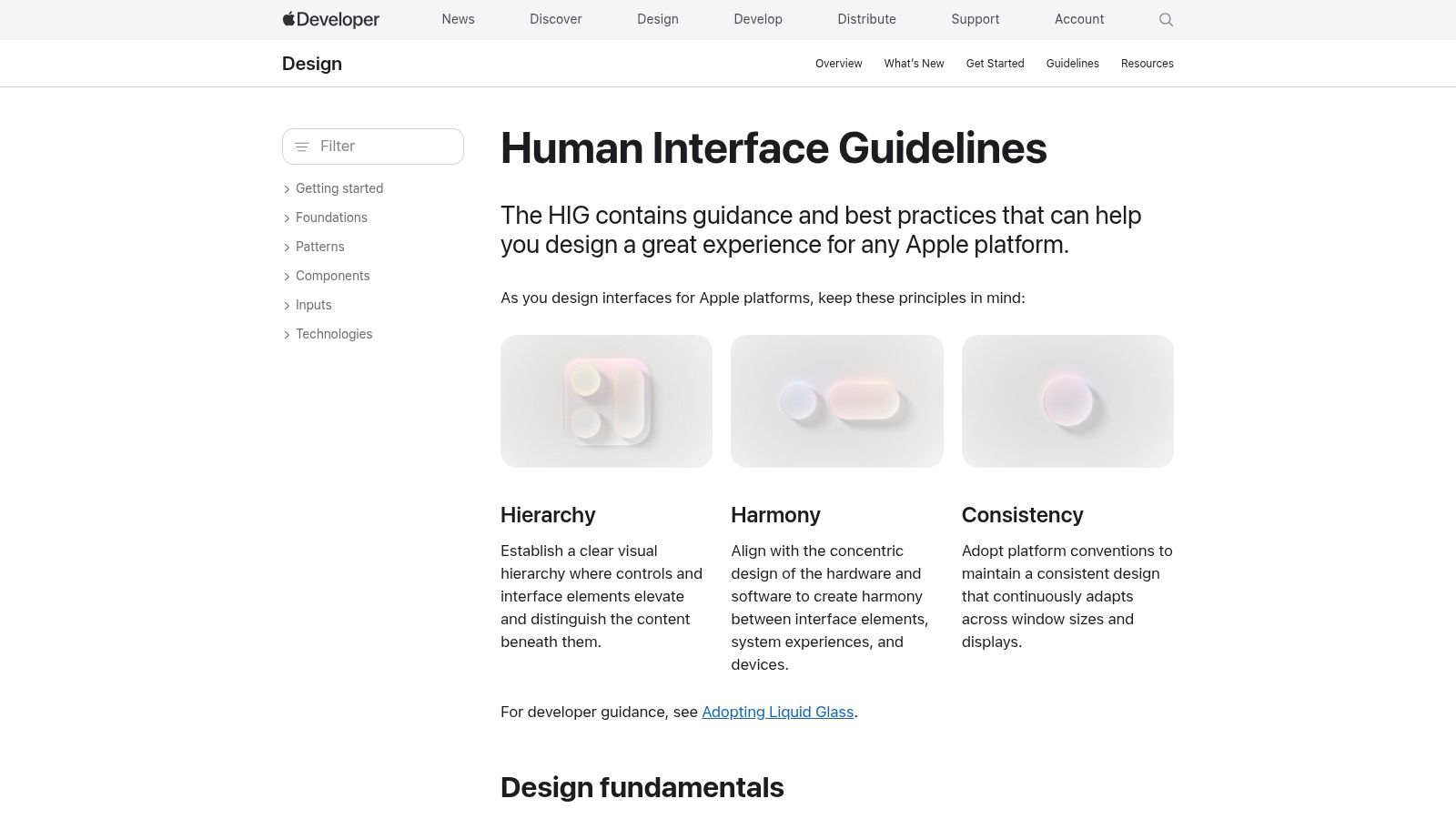
The HIG covers everything from navigation patterns to component specifications. It's free, continuously updated, and includes downloadable design templates for Figma and Sketch. For iPhone-specific design guidance, see this guide to designing apps for iPhone.
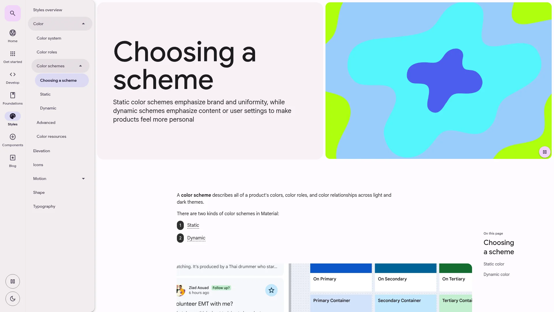
Google Material Design 3 Expressive
Google's Material Design 3 received a major update in 2025: M3 Expressive. Backed by 46 studies with over 18,000 participants, it's Google's most rigorously researched design refresh ever. The headline result: users identified key UI elements up to 4× faster in expressive layouts compared to previous M3 designs.
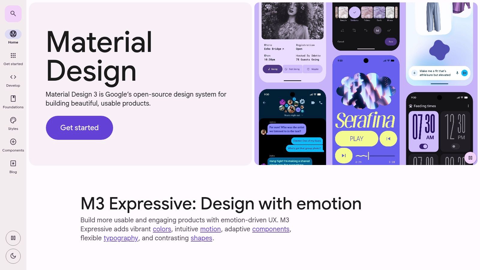
M3 Expressive introduces a spring-based motion system, 35 new shapes with morphing capabilities, larger typography with heavier weights, and background blur for depth. It showed up to 87% preference among 18–24 year-olds and leveled performance gaps between older and younger users.
3. Build Accessibility In from Day One
Accessibility is no longer a nice-to-have checkbox. The EU Accessibility Act has been in force since June 28, 2025, covering all 27 EU member states. France has already filed court summons against major retailers. The Netherlands is running spring 2026 audits. Penalties range from €75,000 to €100,000 per violation depending on the country.
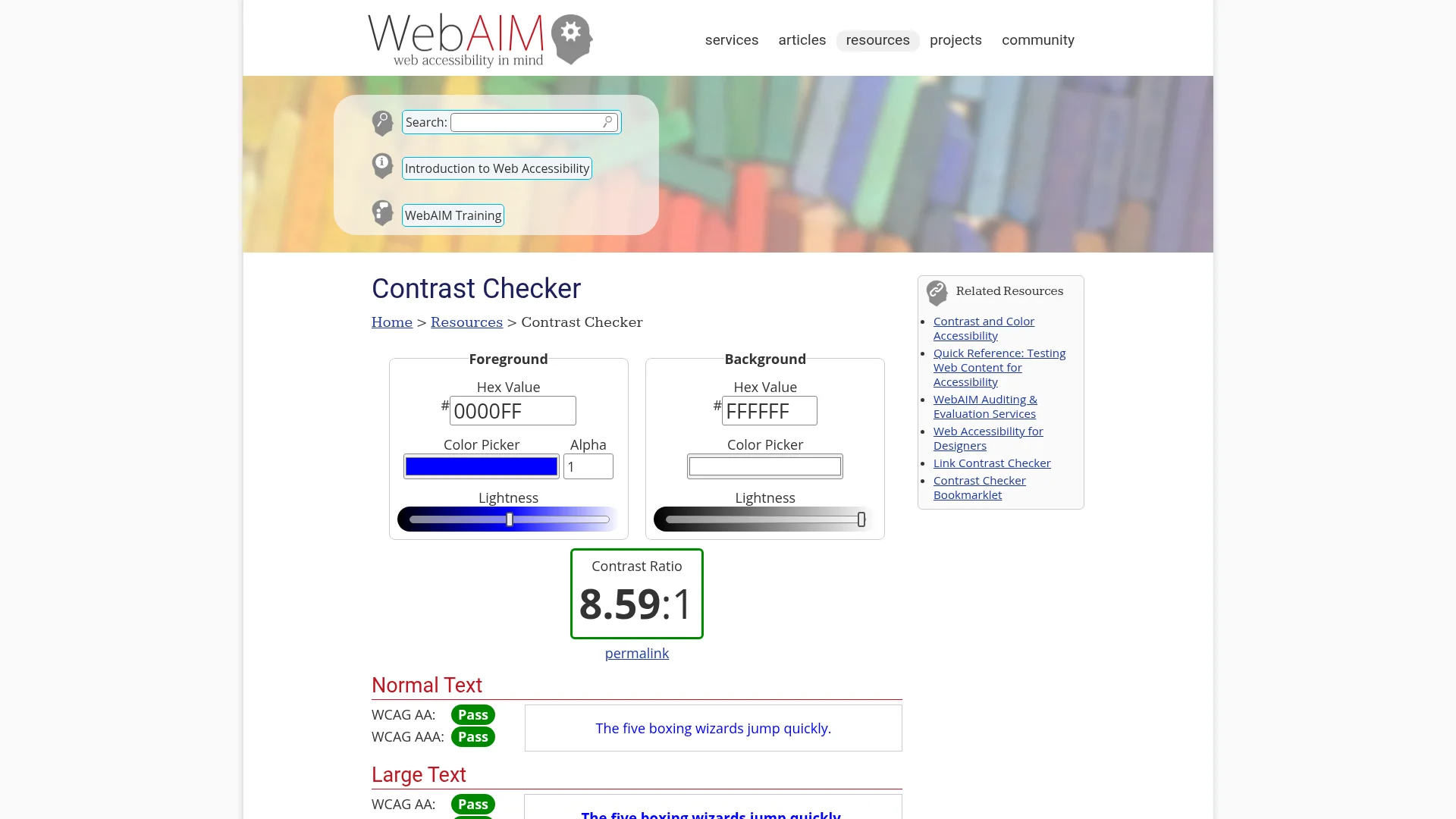
Beyond compliance, accessible design is smart business. Over 15% of the global population lives with some form of disability, and inclusive apps see up to 35% higher engagement. Since WebAIM's annual analysis finds only a small fraction of top sites meet full compliance, getting this right is also a competitive edge. Here are the non-negotiables:
Color contrast: Minimum 4.5:1 ratio for normal text, 3:1 for large text (WCAG 2.2)
Dynamic type: Support system font size preferences; never hardcode font sizes
Screen readers: All interactive elements need labels for VoiceOver (iOS) and TalkBack (Android)
Gesture alternatives: Every swipe or pinch must have a tap-based fallback
Motion sensitivity: Respect the "Reduce Motion" system setting
The technical standard EN 301 549 v4.1.0 referencing WCAG 2.2 is expected to be finalized by Q3 2026. Start implementing now rather than scrambling to retrofit later.
4. Support Dark Mode
82% of mobile users prefer dark mode when it's available. On OLED screens, it reduces power consumption by 14–58%. And 92% of top-tier apps now support system-wide dark themes. If your app doesn't offer dark mode in 2026, it feels outdated before the user even starts.
Implementation tips that often get overlooked:
Don't just invert colors. Pure white text on pure black causes halation for the roughly 50% of people with uncorrected astigmatism. Use off-white (#E0E0E0) on dark gray (#121212) instead.
Test your images. Logos and illustrations designed for light backgrounds often look wrong in dark mode. Provide alternate assets where needed.
Respect system preferences. Default to the user's OS setting. Let them override within your app if they want to.
Rethink elevation. Shadows are invisible on dark backgrounds. Use lighter surface colors to indicate elevation instead.
5. Optimize for Speed
Speed is a design decision. 53% of mobile users leave if a page takes longer than 3 seconds to load, and a 1-second delay can erase 20% of potential sales. Yet 70% of mobile pages still take over 5 seconds to render above-the-fold content.
Focus on these performance fundamentals:
Target LCP under 2.5 seconds. Largest Contentful Paint is Google's primary loading metric and a confirmed ranking factor.
Lazy load below-the-fold content. Only load what's visible on screen. Defer everything else.
Minimize network requests. Bundle API calls, cache aggressively, and use optimized image formats like WebP.
Show loading states. Skeleton screens and progress indicators make waits feel shorter. Never show a blank screen.
A 1-second improvement in load time can boost conversions by 12% or more. This is often the highest-ROI improvement you can make.
6. Create Clear Visual Hierarchy
Users don't read apps; they scan them. Visual hierarchy determines what gets noticed first, second, and third. Without it, users feel overwhelmed and leave. Every screen should have one clear primary action.
Four principles that drive effective hierarchy:
Size and weight: Larger, bolder elements draw attention first. Your primary CTA should be the most prominent element on screen.
Color and contrast: Use your accent color sparingly, only on primary actions. When everything is highlighted, nothing stands out.
Spacing and grouping: Related elements should be closer together. Use whitespace to separate distinct sections. Cramped interfaces feel chaotic.
Typography scale: Limit yourself to 2–3 font sizes per screen. M3 Expressive recommends distinct roles: display, headline, title, body, and label.
For a deeper dive into building effective interfaces, this guide to app user experience covers visual hierarchy patterns in more detail.
7. Prototype and Test Before You Build
The most expensive design mistakes are the ones you catch after launch. Prototyping and user testing find usability issues when they're still cheap to fix, before a single line of production code is written.
A practical testing workflow:
Paper prototypes for early concept validation. Fast, free, and surprisingly effective at catching navigation problems.
Interactive prototypes in Figma or Framer for testing realistic interactions. Test with 5 users to find roughly 85% of usability issues (Nielsen Norman Group research).
A/B testing in production for optimizing specific flows. Data beats opinions for decisions like button placement, onboarding steps, or CTA copy.
AI has changed how prototyping starts. Instead of a blank canvas, designers now generate a working draft in minutes and react to it. Tools like Figma Make, v0, and Claude Code turn a text prompt into interactive screens, while CatDoes goes a step further and turns a prompt into a working, deployable app with real data and auth. That means usability tests run on something that behaves like the finished product, not a static mockup.
Every $1 invested in UX research yields an average return of $100, a 9,900% ROI. If you want to move fast from prototype to working product, this guide to MVP development for startups explains how to validate your core concept before committing to full development.
App Design Best Practices at a Glance
Practice | Key Metric | Effort | Impact |
|---|---|---|---|
Touch-first design | 44pt minimum targets | Low | 3× fewer tap errors |
Platform guidelines | Apple HIG / M3 Expressive | Medium | Higher adoption, native feel |
Accessibility | WCAG 2.2 AA | Medium | 35% higher engagement + legal compliance |
Dark mode | 82% user preference | Medium | 14–58% battery savings on OLED |
Speed optimization | LCP under 2.5s | Medium–High | 12%+ conversion lift per second saved |
Visual hierarchy | 1 primary action per screen | Low | Lower cognitive load, fewer drop-offs |
Prototype and test | 5 users find 85% of issues | Low–Medium | $100 return per $1 invested |
FAQ
What is the most important app design best practice?
Matching your design to platform expectations. iOS and Android users have different interaction patterns, and apps that follow platform guidelines (Apple HIG for iOS, Material Design for Android) consistently see higher retention. After that, accessibility and performance have the widest impact on the broadest range of users.
How do I choose between Apple and Material Design guidelines?
Follow the guidelines for the platform you're building on. iOS apps should use Apple's HIG. Android apps should use Material Design 3. For cross-platform apps, pick one as your primary design language and adapt key patterns (navigation, gestures, typography) for the other platform.
Is dark mode really necessary in 2026?
Yes. 82% of mobile users prefer dark mode and 92% of top apps support it. Beyond user preference, it cuts battery usage by 14–58% on OLED screens and is increasingly expected by accessibility standards. Not supporting it makes your app feel dated.
What accessibility standards apply to mobile apps?
WCAG 2.2 Level AA is the current baseline. It covers touch targets (24×24px minimum), color contrast (4.5:1), and screen reader compatibility. In the EU, the European Accessibility Act has been enforced since June 2025, with penalties up to €100,000. The updated technical standard EN 301 549 v4.1.0 is expected by Q3 2026.
How can I apply these best practices without coding?
No-code platforms let you build functional mobile apps without writing code. CatDoes uses AI agents that handle the entire development process. You describe what you want and the AI generates production-ready code following platform guidelines automatically. This lets you focus on design and user experience instead of implementation.
Start Building
These seven practices, touch-first interfaces, platform guidelines, accessibility, dark mode, performance, visual hierarchy, and user testing, form the foundation of every successful mobile app in 2026. The tools and standards keep evolving, but the core principle stays the same: design for your users, not for yourself.
Ready to put these practices into action? CatDoes uses AI agents to turn your design concepts into fully functional apps, no coding required. The AI follows platform guidelines and accessibility standards automatically, so you can focus on creating the best experience for your users. Start building with CatDoes today.
Nafis Amiri
Co-Founder of CatDoes