
Blog
Insights
Figma To React A Modern Developer's Conversion Guide
Transform your workflow with our modern figma to react guide. Learn the tools and techniques to convert designs into clean, production-ready code seamlessly.

Nafis Amiri
Co-Founder of CatDoes

Figma To React A Modern Developer's Conversion Guide
For years, the process of turning a beautiful Figma design into a functional React component has been a source of friction. Let’s be honest: the old-school manual workflow is broken. It’s a tedious, error-prone grind that drains resources and morale.
Developers meticulously inspect Figma layers, hand-coding every piece of CSS and JSX. It's a cycle that almost guarantees inconsistencies between the designer's vision and the final product. Thankfully, modern tools are finally automating a huge chunk of this, generating production-ready code straight from the design file.
Moving Beyond Manual Figma To React Workflows
The hours spent pixel-peeping design files just to translate styles into code are just the start of the problem. After all that effort, the finished component often still doesn't quite match the mockup. Little discrepancies creep in, and the back-and-forth begins.
To really get why this is such a pain point, it helps to have a solid grasp of the React framework itself and how its component-based structure can clash with the static nature of design mockups.
This is the classic disconnect every team runs into, bridging the gap between a clean design concept and the messy reality of interactive code.
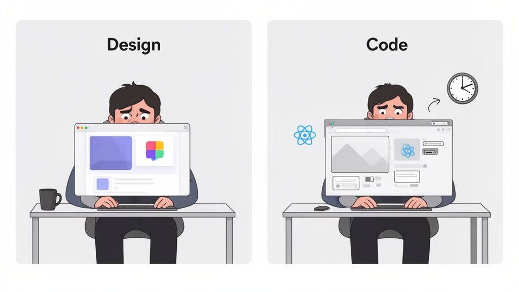
What you’re seeing here is the core challenge: translating a static, visual idea into dynamic, functional software without losing the original intent along the way.
The Problem of Design Drift
One of the biggest headaches with manual Figma to React work is "design drift." This is what happens when the coded UI slowly wanders away from the original design over time.
A padding value is a little off here, a color is a shade too dark there. Before you know it, the live application is a ghost of the polished mockup the designer created. This isn't just an aesthetic issue; it kicks off endless feedback loops and rework, blowing up timelines and frustrating everyone involved.
Manual conversion methods often introduce drift in 70% of projects where design updates outpace the development team's ability to keep up. This inefficiency highlights a critical bottleneck in modern application development.
A Necessary Shift to Automation
The manual Figma to React process is a massive time sink, but newer AI-powered tools are completely changing the game. These solutions cut out a huge amount of the repetitive work, generating clean, native-feeling code that respects your design system from the start.
For developers and agencies trying to stay competitive, this is a huge advantage.
Switching to a more automated workflow isn’t just about making life easier. It’s a strategic move to build higher-quality apps faster while maintaining design consistency as your project grows.
Picking The Right Figma To React Conversion Tool
Let's be honest, the market for Figma to React tools is noisy. It’s easy to get lost in a sea of marketing promises. The trick is to ignore the flashy demos and focus on one thing: does it produce clean, maintainable code? Or does it just spit out a visual clone that’s impossible to work with?
The best tools today are AI-powered, and they've gotten surprisingly good at understanding your design intent. But they're not all created equal. Some are laser-focused on vanilla React, while others provide amazing support for libraries like Tailwind CSS or even full-stack frameworks like Next.js. Your choice really boils down to your project's tech stack and your team's workflow.
Code Quality And Framework Support Should Be Your Top Priority
When you're vetting a Figma to React tool, the quality of the code it generates is everything. Does it give you logical, well-structured components, or does it dump a nightmare of absolute positioning and messy inline styles on you? A good tool will respect the hierarchy and Auto Layout you so carefully crafted in Figma.
Look for tools that clearly understand modern front-end development. Key features include:
Tailwind CSS Integration: This is a huge one. The tool should automatically map your Figma styles to Tailwind utility classes. The result is much cleaner and more consistent styling.
Intelligent Component Props: A smart tool will create React props for your components based on the variants and properties you've already defined in your design file.
Real Responsiveness: It needs to translate your Auto Layout rules into flexible CSS like Flexbox or Grid, ensuring the UI actually works on different screen sizes.
These are the features that separate the genuinely useful tools from the ones that create more technical debt than they solve.
Your goal isn't just to clone a design; it's to accelerate development. The right tool should get you 80% of the way to a production-ready component, freeing you up to focus on business logic and state management.
The current landscape is dominated by AI tools that can slash your development time significantly.
A Quick Comparison Of The Top Tools
To help you sort through the options, here’s a quick breakdown of some of the leading tools. Each has its own strengths, so the "best" one really depends on what you're building.
Comparing Top Figma To React Conversion Tools
This table compares the key features, target audience, and pricing of leading conversion tools to help you choose the best fit for your workflow.
Tool Name | Best For | Key Features | Pricing Model |
|---|---|---|---|
Locofy.ai | Teams needing high-fidelity React/Next.js code with Tailwind CSS. | AI-powered code generation, component prop mapping, design system syncing, live prototypes. | Freemium, with paid plans for more features. |
Anima | Front-end teams looking to generate interactive code for React, Vue, and HTML. | Converts designs into playable prototypes and code, good for design systems. | Free tier, with paid plans for team features. |
TeleportHQ | Developers who need a low-code platform for building static sites and UI. | Visual editor, real-time collaboration, code export for React, Next.js, Vue. | Free for small projects, with paid plans for more exports. |
Clutch | Teams that want a visual IDE to build and deploy React apps directly from Figma. | Real-time collaboration, component-based workflow, integrates with Storybook. | Free to start, with usage-based pricing. |
Choosing the right tool is about aligning its capabilities with your project's specific needs, from the framework you use to how your team collaborates.
Evaluating Tools For Your Specific Use Case
The "best" tool is always relative to your situation. Are you a solo founder trying to ship an MVP as fast as possible? Or a developer at a large agency that needs to maintain a complex design system? Different scenarios demand different solutions. Our guide on rapid app development tools dives deeper into this idea, helping you match the right tool to your project goals.
Here’s a look at the Locofy.ai plugin interface inside Figma, which gives you a sense of how these tools work.
As you can see, the panel is clean and organized. It lets you tag Figma layers to define their behavior (like marking something as a button or an input), which ensures the final code is semantically correct and functional.
This deep integration is crucial. For instance, some advanced workflows are now using Cursor with Figma for design-to-code automation, blurring the line between the design tool and the code editor. By carefully picking a tool that fits your technical needs, team skills, and budget, you can turn the Figma-to-React process from a chore into a massive productivity booster.
How to Prep Your Figma Designs for a Clean Handoff to Code
The quality of code you get from any Figma-to-React tool is a direct mirror of how well you've structured your design file. It's that simple. A messy, inconsistent design will always spit out messy, unusable code. Garbage in, garbage out.
To get clean, maintainable React components, you have to start thinking like a developer long before you write a single line of code. This means structuring your Figma file in a way that a machine can logically interpret your design intent.
Master Auto Layout for Actual Responsiveness
Just dragging and dropping elements into place is a recipe for disaster. When a conversion tool sees manually positioned items, it almost always falls back on absolute positioning in CSS. That’s a nightmare for building anything that needs to work on more than one screen size.
Instead, you need to use Figma's Auto Layout for everything.
Think of Auto Layout as the design equivalent of CSS Flexbox. It’s how you tell the converter how elements should stack, wrap, and resize in relation to each other. Getting this right is the single most important step for generating code that is genuinely responsive.
Enforce Strict Naming and Organization
A logical layer hierarchy is non-negotiable. If your layers are a sea of Rectangle 27 and Group 104, the converter has zero context. It has no way of knowing that Rectangle 27 is supposed to be a button.
Adopt a clean, consistent naming convention for every layer and component.
Use descriptive names: Think
btn-primary,card-header, orinput-field-email.Group related layers: Always group elements that belong together, like a label and its corresponding input field.
Structure your pages: Use frames to organize different sections like
Section-HeroorSection-Features.
This discipline translates directly into more readable, semantic HTML and JSX. The resulting React components will be far easier for a developer to understand, use, and extend.
Build a Cohesive Design System
A design system is your single source of truth for all visual styles. In a Figma-to-React workflow, it's not optional. Instead of applying colors and fonts manually to each element, define them once as reusable styles.
Establishing a robust system of design tokens for colors, typography, and spacing is foundational. It ensures that the generated code uses variables (like
--color-primary-500) instead of hardcoded hex values, which is essential for maintainability.
This practice keeps your design consistent and makes global updates ridiculously easy. When you're ready to dig deeper into creating a solid foundation, check out our guide on app design best practices.
Putting in this prep work upfront empowers any automation tool to accurately translate your design, saving you countless hours of refactoring horrible code down the line.
A Practical Walkthrough Of The Conversion Process
Alright, once your Figma file is properly structured, we get to the fun part: turning your design into actual, working code. This isn't just a one-click magic trick. A bit of thoughtful prep work here ensures the code you get is clean, readable, and slots right into your React project without a fight.
We'll walk through this using the kind of workflow you'd find in a popular conversion tool. It usually starts with installing a plugin from the Figma Community. With the plugin ready, you can select a component, a group of elements, or even an entire frame you want to bring to life.
From Selection To Code Export
After you've highlighted your design element in Figma, you'll pop open the plugin's panel. This is where the conversion really kicks off. The tool scans your selection, picking up on layers, Auto Layout settings, and the design tokens you've so carefully prepared.
A crucial part of this process is "tagging" your elements to give the AI some context. You might tell the tool that a specific frame is a button or a text layer is an h1 heading. This is what separates a meaningful, accessible component from a messy soup of <div> tags.
Once you’ve tagged your elements and the preview looks good, you're ready to export. Most modern tools give you options for how you want your styling handled, such as CSS Modules, Styled-Components, or Tailwind CSS. For this guide, we’ll focus on Tailwind, since it pairs so well with utility-first design systems.
A Real-World Example: A Login Form
Let's say you've designed a simple login form. It has a title, two input fields for email and password, and a submit button.
In Figma, you've already grouped the label and input for both email and password. You also used Auto Layout to manage all the spacing and make sure it's responsive. Now, using the plugin:
Select the entire form component. This tells the tool to analyze the relationship between all the child elements.
Tag the elements. You’d tag the email and password fields as
<input>, their labels as<label>, and the button as<button type="submit">. This semantic tagging is what makes the output truly functional.Configure props for interactivity. The smarter tools will let you define which parts of the component need to be dynamic. You could create props for the button text or input placeholders, which makes the final React component much more reusable.
The tool will then generate a JSX file for your LoginForm component, complete with Tailwind classes that perfectly mirror your Figma styles.
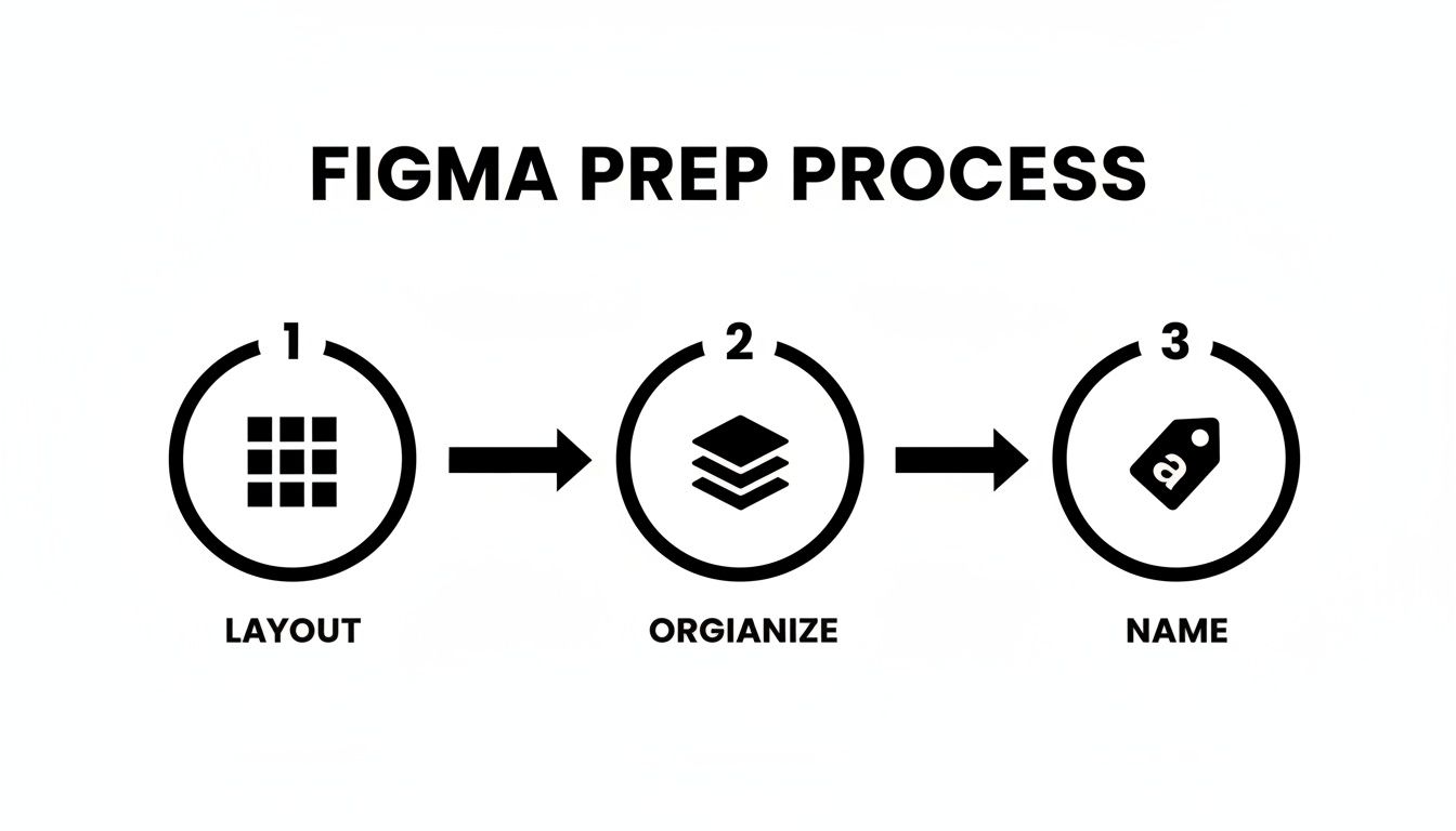
This simple, three-step visualization sums up the core principle of preparing any design for code conversion: define the layout, organize the structure, and name everything logically.
This workflow gives the conversion tool all the context it needs to translate your visual design into a logical, well-structured codebase.
Integrating Code And Managing State
The code you get from the tool is a fantastic starting point, but it's almost never the finished product. It gives you the visual scaffolding, but you still need to wire it up with state and logic.
After you copy the generated JSX into your React project, the next job is connecting it to your app's state management. For our login form, that means using the useState hook to manage the values of the email and password inputs.
Remember, the generated code handles the "what it looks like," while you, the developer, are responsible for "how it works." This separation of concerns is a core principle of component-based development and is fully supported by the Figma to React workflow.
You’ll add onChange handlers to the input elements to update their state as a user types and an onSubmit handler to the form to manage the actual login logic. The generated code becomes the clean, predictable UI layer of your component, leaving you to focus on implementing the functionality that actually makes it useful. This mix of automated UI generation and manual logic is where you'll find the biggest boost in productivity.
Refining Generated Code For Production
Automated code generation gives you a massive head start, but it's crucial to see it as the first draft, not the final product. The raw output from a Figma to React tool is your foundation. Your job as a developer is to take that well-structured UI and infuse it with the logic, state, and optimizations that make it a production-ready component.
This is where the real work begins: transforming a static visual into something dynamic and interactive. It's about refactoring for reusability, connecting to real data, and ensuring the final component is both accessible and performant.
From Static UI To Interactive Components
The first order of business is to make the component interactive. This almost always starts with React Hooks. You'll lean on useState to manage local component state, like tracking input values, handling toggle switches, or controlling visibility.
A generated modal component, for instance, might look pixel-perfect, but it won't actually open or close. You'll need to add a state variable like const [isOpen, setIsOpen] = useState(false); and then wire it up to the button and the modal container. This is the fundamental first step in breathing life into static JSX.
Refactoring For Reusability And Scalability
A component spit out by a generator is often a single, monolithic block of code. To make it truly useful across your application, you need to break it down. Look for opportunities to extract smaller, reusable pieces.
Deconstruct into smaller components: A complex card component could be broken down into
CardHeader,CardBody, andCardFooter.Abstract logic with custom hooks: If you find yourself repeating the same state logic, pull it out into a custom hook for a much cleaner implementation.
Define clear props: Pinpoint which parts of the component need to be dynamic and expose them as props. This allows other developers to use your component with different data without ever touching its internal structure.
The popularity of these tools is undeniable. Figma plugins for React conversion have now surpassed 1.5 million combined users. For instance, Builder.io's Visual Copilot has over 600,000 users, while Anima has attracted 900,000 users by delivering clean components that can cut implementation time significantly. You can find more details about these tools and their impact on development workflows on GeeksforGeeks.
Think of the generated code as a perfectly assembled set of LEGO bricks. Your job is to organize them into smaller, reusable kits that can be used to build anything, rather than just the one specific model they were originally intended for.
Connecting To Data And Ensuring Accessibility
A component isn't truly done until it's populated with real data and is accessible to all users. This means fetching data from APIs and adding the necessary ARIA attributes.
You’ll typically use the useEffect hook to fetch data when the component first mounts. This is how you connect your polished UI to a live backend, pulling in everything from user profiles to product lists.
As you integrate this data, you also have to think about accessibility. Add ARIA attributes like aria-label for icon-only buttons or aria-required="true" for critical form fields to make sure your component works well with screen readers. These final touches are what elevate your component from a simple UI element to a robust, professional piece of your application, ready for deployment. For more on this final stage, explore these continuous deployment best practices.
Figma to React: Your Top Questions, Answered
Jumping from Figma to React always brings up a few key questions. I've heard them from dozens of teams, and getting the answers straight from the start makes the whole process smoother. Let's clear them up.
How Good Is The Code These Tools Actually Generate?
This is the big one. Honestly, the accuracy of modern AI tools is impressive, if you set them up for success. For a Figma file that uses Auto Layout and components correctly, you can realistically expect 80% to 90% accuracy on responsive layouts. That's a huge head start.
Where you'll still need to step in is with complex, state-driven interactions or custom animations. The tool will get the structure, but a human developer is still needed for the fine-tuning. Just remember, the quality of your Figma file directly dictates the quality of the code you get back.
Can I Use These Tools For React Native Too?
Absolutely. Many of the best conversion platforms now fully support React Native development. Tools like Locofy.ai and Anima were built with both web and mobile in mind, generating components that work for both targets.
That said, always double-check the tool’s documentation. Some are definitely web-focused, while others are built to handle the specific needs of mobile development and React Native's styling system.
Is The Generated Code Actually Maintainable?
The days of old-school generators spitting out messy, absolute-positioned divs are long gone. Today's best tools produce clean, component-based code using modern standards like utility-first CSS. This code is far more maintainable than you might think.
The smartest way to work is to use these tools for generating individual components, not entire pages at once. This lets you integrate the clean, AI-generated code into your existing projects without creating a mess. It keeps your codebase clean and easy to manage.
What's The Single Biggest Mistake People Make?
Easy: rushing the design prep. I've seen it time and again when a developer gets excited, throws a messy Figma file at a tool, and gets unusable code back. It completely defeats the purpose.
A design with inconsistent naming, no Auto Layout, and poorly defined components will always produce a frustrating mess. Taking the time to structure your Figma file properly isn't just a "nice-to-have," it's the most critical step. Get that right, and you'll save yourself countless hours of cleanup later.
Ready to turn your ideas into fully functional apps without the manual grind? CatDoes uses an AI-native platform to transform natural-language concepts into production-ready mobile and web applications. From design to deployment, we automate the entire workflow so you can launch faster. Start building your app for free today at CatDoes.
Nafis Amiri
Co-Founder of CatDoes


