
Blog
Tutorials
App User Experience (UX): A Guide for Creators in 2026
Discover what separates a good app from a great one. This guide breaks down the core principles of app user experience to help you build products people love.

Nafis Amiri
Co-Founder of CatDoes

In a market crowded with millions of apps, one that simply works is no longer enough. What turns a first-time download into a daily habit is the app user experience (UX): the sum of every interaction someone has with your product, from the first tap to the hundredth. Great UX is the invisible craft behind all modern app experiences.
Get it right and a curious visitor becomes a loyal user. Get it wrong and you earn an instant uninstall.
TL;DR: Great app UX rests on five pillars: usability, interaction design, performance, visual design, and accessibility. Prioritize clarity, design for the thumb zone, and keep patterns consistent. Measure success with quantitative metrics (retention, task success rate, churn) and qualitative feedback (surveys, reviews, usability testing), and avoid the three biggest UX killers: confusing navigation, pushy permission requests, and bloated onboarding.
Table of Contents
What Is App User Experience (UX)?
Why Your App User Experience Is Everything
The Five Pillars of a Great App Experience
Essential App UX Design Principles
How to Measure and Improve Your App Experience
Common UX Pitfalls That Can Sink Your App
Frequently Asked Questions About App UX
What Is App User Experience (UX)?
App user experience (UX) is the sum of every interaction a person has with your mobile app, from the first tap to the hundredth. It covers not just what your app does, but how it feels to use, spanning five areas: usability, interaction design, performance, visual design, and accessibility.
Sometimes called application user experience, app UX is what separates a product people tolerate from one they genuinely enjoy. Strong UX design for apps makes tasks feel effortless, guides people without them noticing, and builds the trust that keeps them coming back.
Why Your App User Experience Is Everything
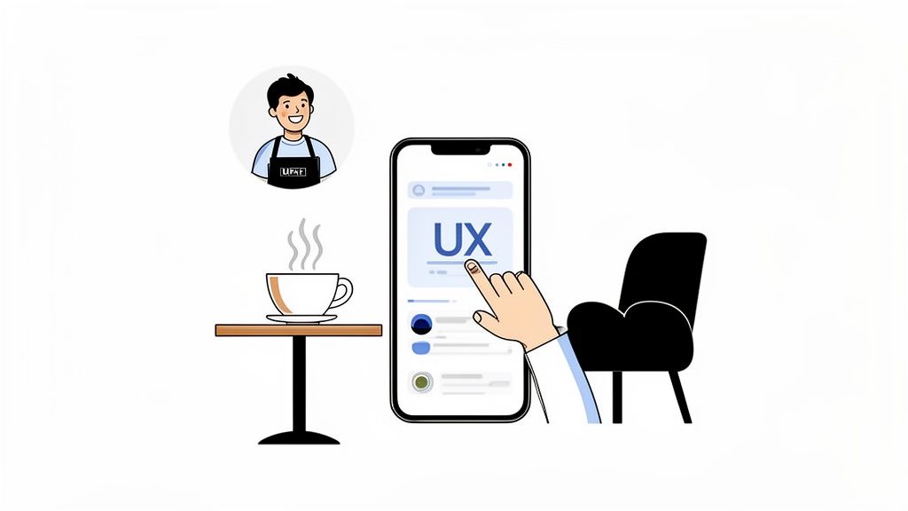
Think of your app like a coffee shop. You might come in for the promise of a great latte (the core function), but the experience is what brings you back: the comfortable chairs, the barista who remembers your order, the easy-to-read menu, the general vibe.
An app's user experience is the sum of all those parts. It isn't just what your app does, but how it feels to use. A strong UX makes tasks feel simple, guides people without them noticing, and builds the kind of trust that keeps them coming back.
The Business Impact of Great UX
Getting UX right is not a "nice-to-have." It is a direct driver of business results. When people enjoy using your app, they stay longer, open it more often, and recommend it to others. That shows up as higher retention and better app store reviews.
Poor UX does the opposite. Research consistently shows that people have little patience for apps that are confusing, slow, or buggy. Many users delete an app after a single bad experience, and most of them never come back.
Accessibility experts describe the emotional side of this well: when a digital experience works, it feels like relief, and people feel included and respected. When it doesn't, even simple tasks come with anxiety and hesitation. Getting UX right doesn't just make things easier; it makes people feel capable.
Moving Beyond Simple Functionality
In the early days of the App Store, a working app was often enough to stand out. Not anymore. The market is saturated and expectations have climbed. As of January 2026, users can choose from millions of apps, so your first impression carries enormous weight.
That level of competition means UX can't be an afterthought bolted on at the end. It has to be part of your product strategy from day one, so you build something people don't just need but genuinely enjoy using.
An exceptional UX pays off in several ways:
Builds trust and credibility: A smooth, intuitive interface signals that your app is professional and reliable.
Increases retention: People stick with apps that are a pleasure to use.
Drives positive reviews: Delighted users leave the feedback that attracts new downloads.
Creates a competitive advantage: In a crowded market, superior UX can be the reason someone picks you.
The Five Pillars of a Great App Experience
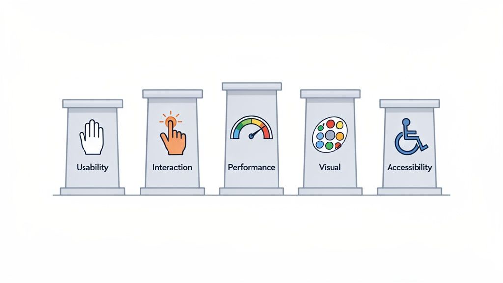
A great app experience isn't built on guesswork. It rests on five connected pillars, each addressing a different part of the user's journey. Neglect one and the whole experience suffers. Here is what each delivers and the cost of getting it wrong.
Pillar | What It Means for the User | The Cost of Neglect |
|---|---|---|
Usability | "I can achieve my goal without thinking." | User frustration, high drop-off rates, and abandoned tasks. |
Interaction | "The app feels responsive and intuitive to my touch." | A clunky, disconnected experience that feels broken or cheap. |
Performance | "It's fast, reliable, and never crashes." | Lost trust, one-star reviews, and immediate uninstalls. |
Visual Design | "This looks beautiful and feels like a brand I trust." | A generic, forgettable app that fails to build an emotional connection. |
Accessibility | "This app was designed for someone like me." | Excluding millions of potential users and creating a subpar experience. |
Usability: The Foundation of Function
Usability answers a simple question: can people achieve their goals easily and intuitively? If your app feels like a puzzle, users abandon it no matter how powerful the features are.
Think of usability as clear signage in a well-organized store, guiding you exactly where you need to go. It means designing an interface that feels familiar and predictable. Good usability is usually invisible; when things just work, people don't notice the design, they simply enjoy the flow.
Interaction Design: The Feeling of Control
If usability is about what users can do, interaction design is about how it feels. It focuses on the tactile experience of tapping, swiping, and navigating, and provides feedback that makes the app feel responsive and alive.
That could be a subtle animation when a button is pressed or a smooth transition between screens. These small details tell users what's happening and keep them in control. You can learn more in our guide to app design best practices.
Performance: Speed and Reliability
Performance is non-negotiable. Users expect instant responses, fast load times, and a crash-free experience. A slow or buggy app is one of the quickest ways to lose trust and earn a one-star review.
Imagine ordering food from an app that takes forever to load the menu, then crashes right before you confirm payment. That kind of friction leaves a lasting negative impression. High performance means your app is fast and stable, delivering on its promise every time.
Visual Design: The Emotional Connection
Visual design is about more than looking good. It creates an emotional connection and reinforces your brand, covering everything from color and typography to imagery and layout.
Strong visual design also guides the user's eye to the information and actions that matter. A well-crafted identity builds familiarity and trust before someone reads a single word. Think of Duolingo or Headspace: their look is instantly recognizable and a core part of the experience.
Accessibility: Designing for Everyone
A truly great experience is an accessible one. That means designing so people with a wide range of abilities can use your app effectively, including those with visual, motor, auditory, and cognitive disabilities.
As of January 2026, many apps still fall short and create barriers for a large share of potential users. Accessibility isn't only a legal or ethical requirement; it is a marker of quality. Features like high-contrast text and screen reader support help everyone, making your app more usable in more situations.
Essential App UX Design Principles
Knowing the theory behind great UX is one thing; building it is another. A handful of practical principles for UX design for apps bridge the gap between a good idea and an app people actually enjoy. These are the rules of the road for designing screens and interactions that serve the user.
Prioritize Clarity Over Clutter
If there is one golden rule in mobile design, it is to keep things simple. A user should understand your app's purpose and how to navigate it within seconds. Every button, icon, and line of text needs a reason to exist; if it doesn't help the user reach their goal, it's noise.
Take a travel booking app. The goal is to find a flight and book it. An interface crammed with ads, cryptic icons, and endless options just creates friction. A clean design puts a big search bar front and center, uses clear date pickers, and offers one obvious "Book Now" button.
The same applies to your words. Use simple, direct language and skip the jargon. Clear communication is the bedrock of a good app user experience.
Design for the Thumb Zone
Most people use their phones one-handed, which means the thumb does the heavy lifting. The thumb zone is the area a user can comfortably reach without shifting their grip, and placing important controls there is critical for usability.
Here is how to put that into practice:
Bottom navigation: Keep your main tabs at the bottom of the screen, right where the thumb rests.
Action buttons: Place key buttons like "Add to Cart" or "Confirm Booking" in the lower half of the screen.
Swipe gestures: Use intuitive swipes for common actions instead of forcing users to tap tiny icons.
Forcing someone to stretch to a menu at the very top of the screen is a guaranteed moment of frustration. Design for the thumb zone and your app starts to feel like an extension of the user's hand.
Maintain Visual and Functional Consistency
Consistency is what makes an app feel intuitive and trustworthy. When buttons, icons, and menus look and behave the same on every screen, users learn quickly and navigate with confidence. That predictability lowers mental effort and frees people to focus on their task.
Visual consistency means sticking to the same colors, fonts, and icon style throughout. Functional consistency means an action like swiping left always does the same thing. Our guide on best GUI design goes deeper into building this kind of predictable interface.
How to Measure and Improve Your App Experience
A great app user experience isn't something you stumble into. It comes from a deliberate cycle of measuring what users do, learning from it, and making smart improvements. To build something people love, you have to move past assumptions and look at real data.
That starts with two kinds of feedback. Quantitative data is the "what": the hard numbers and trends. Qualitative feedback is the "why": the feelings and thoughts behind those numbers. A solid strategy uses both.
Key Quantitative Metrics to Track
Quantitative metrics are the vital signs of your app's health. They show how people behave, help you spot friction, and turn decisions into evidence rather than hunches. A few worth watching:
Retention rate: The percentage of people who return after their first visit. High retention is one of the strongest signals of value.
Session duration: How long users spend in your app per visit. For content-heavy apps, longer sessions often mean deeper engagement.
Task success rate (TSR): How many users complete a key action, like a purchase or onboarding. A low TSR is a red flag for usability problems.
Churn rate: The flip side of retention, the share of users who leave over a period. Rising churn usually means the experience is slipping.
Gathering Rich Qualitative Feedback
Numbers tell you what is happening but not why. Qualitative feedback fills that gap, revealing user frustrations, motivations, and desires. You can gather it in a few straightforward ways:
User surveys: Use in-app prompts or short email surveys to ask directly about the experience.
App store reviews: Your App Store and Google Play reviews are a goldmine of honest feedback. Watch for recurring themes.
Usability testing: Watch real people try to complete specific tasks. You'll uncover issues you would never have spotted on your own.
Combine these stories with your metrics and you get a clear roadmap for improvement. If this is new to you, our guide on prototyping and testing is a great place to start.
Adopting a Continuous Improvement Mindset
The app market never sits still. Global mobile app downloads reached roughly 136 billion in 2024, a slight dip that points to a maturing market where the quality of the experience matters more than raw download volume.
Users are getting more selective, and their expectations for seamless design keep rising. In that environment, improving UX isn't a one-and-done project. The best teams work in a continuous loop of measuring, building, and learning, making small iterative improvements that add up over time. It results in a better product and shows stakeholders you can adapt and grow.
Common UX Pitfalls That Can Sink Your App
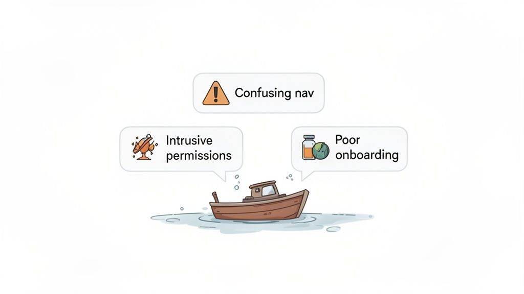
Learning from where others went wrong is one of the fastest ways to get your own product right. Even experienced teams fall into traps that quietly undermine a great app user experience. Knowing what they look like helps you steer clear of the frustration that leads straight to the uninstall button.
These aren't obscure technical bugs. They are fundamental design flaws that break trust and stop users from ever seeing your app's value. Here are three of the most damaging, and how to avoid them.
Confusing or Inconsistent Navigation
Nothing kills momentum faster than navigation that leaves people feeling lost. If users can't find what they need, they assume your app is broken or too complicated to bother with. This usually comes from unlabeled, unconventional icons or key functions buried in confusing menus.
A classic example: a "profile" icon that opens settings on one screen and a social feed on another. That inconsistency forces people to re-learn your app's logic every time, which is exhausting.
The fix: Stick to familiar patterns users already understand, like a bottom tab bar for primary actions. Pair clear, recognizable icons with simple text labels. When it comes to navigation, consistency wins.
Aggressive and Untimely Permission Requests
Have you ever opened a brand-new app only to be hit with a wall of pop-ups asking for your location, contacts, and notifications? It feels invasive, and it breaks trust before you've even seen what the app does.
Demanding personal information up front makes users suspicious. They haven't seen any value yet, so why would they hand over private data?
The fix: Ask for permissions only when a specific feature needs them. Request camera access the moment someone taps to take a photo, not on first launch. A brief, one-sentence explanation of why you need it goes a long way toward building confidence.
Overwhelming or Ineffective Onboarding
A bad onboarding flow is a huge missed opportunity. Some apps drown new users in a long, unskippable tour of every feature; others offer no guidance at all. Both fail to communicate the app's real value.
Attention is scarce. Global app usage reached a staggering 1,350 billion hours in 2024, but most of that time goes to a handful of top-tier apps. As expectations for intuitive interfaces keep rising through 2026, a clunky first impression can be fatal, and many apps lose the bulk of their users right after installation. You can dig into more mobile app usage trends on Appinventiv.
The fix: Design onboarding to deliver an "aha" moment as fast as possible.
Guide users through one key task that shows off your app's primary value.
Make tutorials optional and easy to skip or dismiss.
Use progressive disclosure, introducing advanced features once the basics click.
Frequently Asked Questions About App UX
How can I test my app's user experience on a tiny budget?
You don't need a big budget for UX testing. The simplest approach is to ask a few friends or colleagues to complete a specific task in your app while you watch. This informal "over-the-shoulder" testing is remarkably revealing; you'll see exactly where people hesitate, get stuck, or tap the wrong thing. A short online survey with a few user experience testing questions helps too. The key is observing real people interacting with your work.
What is the single most important part of app UX?
While all five pillars matter, everything comes back to clarity. If users don't immediately understand what your app is for or what to do next, nothing else matters. A clean, intuitive interface that helps someone reach their main goal without overthinking is the foundation of a great experience. Always prioritize making things easy to understand.
Should I design for iOS or Android first?
It depends on your audience, so start by figuring out where your users actually are. If they're overwhelmingly on iPhones, begin with iOS and follow Apple's Human Interface Guidelines. If they're mostly on Android, start with Google's Material Design principles. For a mixed audience, aim for a consistent brand feel while respecting each platform's native patterns so your app feels at home on any device.
Ready to turn your idea into a production-ready app without the traditional hurdles? With CatDoes, you describe your vision in plain language and let AI agents handle the design, coding, and backend setup. Build, test, and launch your mobile app faster than ever. Start building for free at CatDoes.com.
Nafis Amiri
Co-Founder of CatDoes