Blog
Tutorials
How to design a web app: A Practical Guide to Fast, User-Centric UI
Learn how to design a web app with actionable steps for research, prototyping, UI, and faster launch.

Nafis Amiri
Co-Founder of CatDoes
How to design a web app: A Practical Guide to Fast, User-Centric UI
Every great web app starts not with a line of code or a pixel-perfect design, but with a simple, powerful foundation: understanding who it's for and what it needs to do. It's a structured process that moves from a clear strategy to visual design, prototyping, and finally, a package ready for developers.
Skipping this foundational work is a recipe for costly mistakes. You end up building something nobody actually wants or needs.
Defining Your App's Purpose and Audience
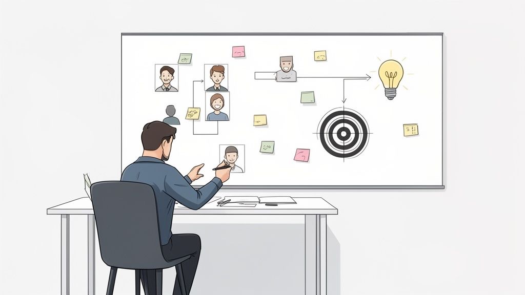
Before you ever think about colors, fonts, or fancy layouts, you have to nail down two fundamental questions: What problem does this app solve? And for whom? A cool idea isn't enough; a successful app is a solution to a real person's problem. Jumping straight into Figma without this clarity is like building a house without a blueprint. You might build something, but it's not going to be what you need.
The cost of getting this wrong is huge. The global web design market is racing toward USD 100 billion by 2031, and even basic designs can run anywhere from $6,500 to $15,000. An almost unbelievable 80.8% of redesigns happen because the first version failed to convert users, a direct result of poor initial strategy.
Get it right, though, and the payoff is massive. A truly great user experience can skyrocket visit-to-lead rates by over 400%. This is why modern tools like CatDoes, which use AI to generate apps directly from ideas, are becoming so critical. They help you sidestep those crushing upfront costs and validate your direction from day one. You can discover more insights about web design statistics that back this up.
Identify Your Core Value Proposition
Your value proposition is just a clear, simple statement explaining how your app fixes a customer's problem or makes their life better. It’s the main benefit you’re offering.
To figure it out, ask yourself what makes your app different. Is it faster? Cheaper? More intuitive? Does it have one killer feature that nobody else does?
For example, if you're building a project management tool, your value prop could be: "The simplest way for small teams to manage tasks without all the confusing bells and whistles." That single sentence tells you exactly who your audience is (small teams) and what your key benefit is (simplicity).
A strong value proposition is your north star. It guides every single feature decision you make, keeping you focused on solving the core problem instead of getting lost in a sea of unnecessary complexity that just confuses users.
Understand Your Target Audience with User Personas
You can't design an effective app for a ghost. You have to deeply understand the people who will actually be using it. User personas are my favorite way to do this. A persona is basically a fictional character you create to represent your ideal user, built from real research and data about your potential customers.
A good persona is more than just demographics. It digs into what really matters:
Goals: What is this person trying to accomplish with your app?
Motivations: What drives their decisions? Why would they choose you?
Pain Points: What are the frustrations and challenges they face right now that your app can solve?
Technical Proficiency: Are they a power user or someone who struggles with new tech?
Creating two or three detailed personas is a game-changer. It ensures every design choice you make is anchored to a real human need. This user-centric approach isn't just a buzzword; it's the bedrock of every single web app that succeeds.
Building Your Blueprint with Wireframes and Prototypes
Once you have a solid grasp on your goals and who you're building for, it's time to give your app a tangible structure. This is where wireframing comes in. A wireframe is a simple, black-and-white sketch of your app's layout. Think of it like the architectural blueprint for a house. It shows you where the rooms, doors, and windows go, but leaves out all the paint colors and furniture for later.
The goal here is purely functional. By stripping away all the visual distractions like colors, fonts, and images, you force yourself to focus on what really matters at this stage: usability and information flow. It's how you answer the tough questions early on, like "Does the navigation make sense?" or "Can a new user find the most important buttons without thinking?"
Starting with Low-Fidelity Wireframes
You don’t need any fancy software to get going. Honestly, a simple pen and paper or a digital whiteboarding tool is all you need for your first low-fidelity wireframes.
This initial sketching phase is all about speed and getting ideas out of your head. You can quickly draw dozens of screen layouts, test different ways a user might move through the app, and throw away the bad ideas without wasting a bunch of time or money. The whole point is to nail down the core structure before you even think about making it pretty.
Here’s a practical way to jump in:
Tackle one user flow at a time. For example, map out every single screen a brand-new user would see during the sign-up process.
Keep it simple. Use basic shapes. Boxes can be images or containers, lines become text, and simple rectangles are your buttons.
Think about what's important. On each screen, decide what information or action is the top priority and place it where a user's eyes will naturally fall.
This part of the process is a progression from rough ideas to a polished, clickable model. To make sense of the different stages, here’s a quick breakdown of how designs evolve.
Fidelity Level | Primary Goal | Common Tools | Key Outcome |
|---|---|---|---|
Low-Fidelity | Explore and validate the core structure and user flows quickly. | Pen & Paper, Whiteboards, Balsamiq | A basic, static blueprint of screen layouts. |
Mid-Fidelity | Refine layout, spacing, and information hierarchy. | Clickable wireframes that simulate navigation. | |
High-Fidelity | Finalize visual design, branding, and micro-interactions. | Figma, Sketch, Adobe XD | A polished, interactive mockup that looks and feels like the final app. |
Each level of fidelity serves a specific purpose, helping you move from a high-level concept to a detailed, ready-for-development design without getting stuck on details too early.
Transitioning to Interactive Prototypes
Once your wireframes feel solid, the next move is to bring them to life. A prototype is a clickable, simulated version of your app that lets you and your users actually test the flows in a realistic way. You simply link your static wireframe screens together to mimic how someone would navigate from one page to the next.
This is an absolutely critical step. A static drawing can't fully capture the experience of using the app. An interactive prototype will instantly reveal usability problems you'd otherwise miss, like confusing navigation paths or dead ends where users get stuck.
Catching these problems now is 10 to 100 times cheaper than trying to fix them after the app has already been coded. A simple prototype can save you a world of headaches down the road.
Putting a working model in front of real people, early and often, is the best way to get honest feedback. It validates your assumptions and makes sure you’re building something people will actually find useful and enjoyable.
Tools like Figma or Adobe XD are perfect for turning those static wireframes into interactive prototypes. For a deeper dive into the process, our guide shows you how to build a prototype of a product from start to finish. This cycle of wireframing, prototyping, and testing is the engine that drives a user-centric design forward.
Crafting a Memorable and Intuitive User Interface
With your app's blueprint locked in, it's time to bring it to life with visual design. This is where you move beyond the skeletal structure and start creating the interface people will actually see and interact with every day. The goal isn't just to make it look good; it's to design an experience that feels so intuitive, it becomes almost invisible.
A great UI is built on a foundation of consistency. This means creating a clear visual language that not only reinforces your brand but also guides the user through the app, making every interaction feel familiar and effortless.
Establish a Cohesive Visual Language
Your app's entire visual identity really boils down to two things: color and typography. Color is much more than decoration because it sets the mood and can subtly influence user behavior. You'll often see a fintech app using greens and blues to build a sense of trust and stability, while a wellness app might lean into softer, natural tones to feel more calming.
Typography is just as critical for creating that polished feel. You need to choose a font that’s easy to read across different sizes and weights. Good typography reduces the mental effort needed to process information, letting users absorb what they're seeing without squinting or struggling.
Think of your color palette, typography, and iconography as the core vocabulary of your app's design. When you use them consistently, they create a familiar and predictable experience that builds user trust and makes your app feel professional and reliable.
Build a Scalable Design System
To keep that consistency intact as your app grows, building a design system isn't optional, it's essential. A design system is simply a collection of reusable components and clear standards that you can assemble to build out new screens and features.
Instead of designing a button from scratch every single time, you create one master button component. This single component has all its states defined, like default, hover, and disabled. The same logic applies to everything else:
Form fields for text input, dropdowns, and checkboxes.
Navigation bars that look and behave the same on every page.
Cards used to display articles, products, or user profiles.
This component-based approach is incredibly efficient. It speeds up the entire design process, guarantees visual consistency across your app, and makes future updates ridiculously easy. Need to change a color or font? Update it in the design system, and it propagates everywhere automatically.
Prioritize Accessibility and Mobile-First Design
Finally, any modern design process has to be inclusive from the start. Designing for mobile-first isn't just a trend; it's a market necessity. Over 70% of e-commerce sales in 2026 are projected to come from mobile devices. The data doesn't lie: companies with responsive mobile sites report 62% sales increases, while over 40% of users will simply leave a site that isn't optimized for their phone. Forcing yourself to design for the smallest screen first makes you focus on what truly matters.
This mobile-centric mindset goes hand-in-hand with accessibility, which 50% of organizations are expected to prioritize by 2026. This means using sufficient color contrast, providing text alternatives for images, and making sure your app is navigable with a keyboard. It's about designing for everyone. Platforms like CatDoes bake this in by letting you generate instant previews and QR code tests on any device, ensuring your design works for every user, everywhere.
Using AI and Modern Tools for Faster Design
The traditional design process has always been a major bottleneck. I've seen it countless times: moving from wireframes to high-fidelity mockups eats up weeks of manual work, endless revisions, and a huge chunk of the budget. All this happens before a single line of code gets written. That sluggish pace just doesn't work for startups and businesses that need to move fast.
Thankfully, the way we design web apps is changing. Modern platforms, powered by artificial intelligence, can now automate huge parts of this workflow. We're talking about condensing weeks of effort into just a few minutes. It’s a fundamental shift that lets creators sidestep the usual grind and get a functional product out the door faster than ever before.
Turn Simple Ideas Into Full Designs Automatically
Imagine describing your app idea in plain English and watching a complete, unique design materialize in real time. That's exactly the power AI-driven tools like CatDoes bring to the table. Instead of meticulously drawing every button, screen, and layout, you just provide a natural-language description of what you want to build.
From that simple prompt, a specialized Designer agent takes over. It interprets your requirements and generates a complete visual theme, including a color palette, typography, and a full suite of user interface components. This isn't about slapping your content into a generic template; it's about crafting a custom design system tailored to your specific concept.
This diagram shows the core elements an AI designer focuses on to build a user interface from scratch.
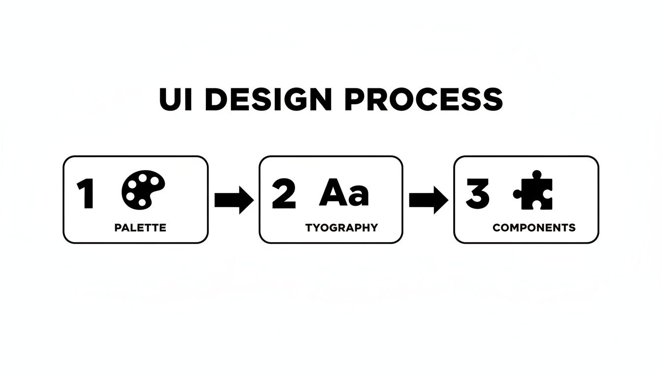
By automating the creation of the palette, typography, and components, the system establishes a consistent and professional visual language in an instant.
And this automated approach doesn't just spit out static images. It generates a real, interactive design that you can immediately test, use, and refine.
Go Beyond Visuals With Multi-Agent Systems
The most advanced platforms take this a step further, using a multi-agent system that handles much more than just the UI. While one agent is busy crafting the visuals, others are working in parallel to build the underlying logic and backend infrastructure. This collaborative AI approach is what truly collapses the timeline from idea to production.
For instance, a system like CatDoes can:
Implement Business Logic: Software agents write the code needed to make your app's features actually work.
Generate the Backend: The platform can automatically set up a scalable backend with a service like Supabase, handling user authentication, databases, and file storage without you lifting a finger.
Enable Instant Previews: You get a live, functioning preview that you can test in your browser or by scanning a QR code to see it on your phone.
This integrated process completely closes the gap between design and development. Instead of a slow, sequential handoff where things get lost in translation, the design, code, and backend are created together, ensuring perfect alignment from the start.
This method opens up app creation to everyone. A non-technical founder can build a fully functional minimum viable product without hiring an entire team. A seasoned designer can turn their mockups into real, working applications effortlessly.
If you're curious about the mechanics behind this, you can learn more about why to use AI in app development and how it unlocks such rapid results. By using these modern tools, the focus shifts from tedious manual labor to creative direction, letting you concentrate on refining your great idea instead of getting bogged down in the technical weeds.
Validating Your Design and Preparing for Development
A design might look pixel-perfect on your screen, but its real worth is only proven when actual people try to use it. This is exactly what usability testing is for. It’s the critical moment you hand your interactive prototype to your target audience to see what clicks and, more importantly, what doesn't.
The insights you get here are pure gold. They shine a light on confusing navigation, vague button labels, or frustrating user flows long before a single line of code gets written. Fixing these problems now is dramatically cheaper and faster than trying to patch them after the app is already built.
Gathering Actionable User Feedback
You don’t need a fancy, two-way-mirror lab to get started. The goal is simple: watch how people interact with your design and really listen to what they have to say. There are a few solid ways to do this.
Moderated Testing: This is where you sit with a user, either in person or over a video call, and guide them through a few tasks. It's great because you can ask follow-up questions in the moment to understand the "why" behind their actions.
Unmoderated Testing: Here, you use a testing platform to send tasks to users, which they complete on their own time. This approach is perfect for gathering a larger volume of quantitative data, like how long it takes to complete a task.
Informal "Hallway" Testing: My personal favorite for a quick gut check. Just grab a colleague or friend and ask them to try out your prototype for five minutes. It’s not rigorous, but it’s amazing for spotting the most glaring issues right away.
No matter which method you choose, the secret is asking the right questions. For some practical examples, check out our guide on the most effective user testing questions that help you uncover genuinely deep insights.
Your design is not finished until users say it is. Every piece of feedback is an opportunity to refine and improve the experience, turning a good design into a great one that people will actually enjoy using.
Preparing a Seamless Developer Handoff
Once you’ve tweaked your design based on user feedback and feel confident it's ready, it’s time to prepare it for development. A clean, organized handoff is the bridge that ensures your design vision becomes a functional web app without any "lost in translation" moments.
And let's be clear, this is more than just slinging over a link to a Figma file. You need to provide rock-solid documentation that leaves zero room for guesswork.
Here’s what a great handoff package looks like:
Detailed Design Specifications: Provide exact measurements for spacing, font sizes, colors, and component dimensions. Thankfully, tools like Figma generate most of these specs automatically.
Exported Assets: Make sure all icons, images, and illustrations are exported in the right formats and resolutions. Think SVG for icons and optimized JPG or WebP for images.
Interactive Prototype Link: Give developers access to the clickable prototype. This lets them experience the intended user flows and see all the micro-interactions in context.
Clear Documentation: Add notes to explain any complex interactions, edge cases, or specific states, like what an error message should say or what a screen looks like when it's empty.
A smooth handoff is the final piece of the puzzle. It prevents frustrating back-and-forth, saves everyone time, and ensures the final product is a perfect match for your well-researched and validated design.
Got Questions About Web App Design? We Have Answers.
If you're diving into web app design for the first time, you probably have a few questions. That's a good thing. Asking the right questions upfront saves a ton of headaches later. Here are some of the most common ones we hear, along with some straight answers from our experience.
What’s the Single Most Important Part of Designing a Web App?
It’s tempting to say the visual design or a cool feature, but the honest answer is the initial discovery and strategy phase. Hands down.
Everything else you build rests on this foundation. Getting a deep understanding of your users, including what they need, what frustrates them, and how they behave, is what separates an app people use from one that just looks nice.
A beautiful interface is completely wasted if it doesn’t solve a real problem for the right audience. A solid user experience strategy is your insurance policy, making sure you build features people actually want, which is what ultimately drives adoption and makes an app successful.
How Long Does This Whole Design Process Take?
The timeline for designing a web app is all over the map. It could be a few intense weeks or stretch out over several months. It really boils down to a few key things: the app's complexity, the number of features you're planning, and the size of your team.
For a simple Minimum Viable Product (MVP), you might be looking at two to four weeks of design work. But for a massive enterprise application with layers of functionality, that could easily become three to six months or more.
Of course, modern tools are changing this game. AI-powered platforms like CatDoes can radically compress these timelines. By automating huge chunks of the design and development work, you can get a functional app up and running in a matter of days, not months.
The real variable is complexity. A single-purpose utility app and a multi-sided marketplace platform exist in completely different universes when it comes to design timelines. Defining your scope upfront is the best way to get an accurate estimate.
Do I Actually Need to Know How to Code to Design an App?
Nope. Not at all. Designing a web app is a completely different discipline from coding it. The design process is all about the user's journey, how information is organized, and what the experience feels like.
Tools like Figma, Sketch, and Adobe XD are the standard for a reason. They let designers create incredibly detailed wireframes and pixel-perfect mockups without ever writing a line of code.
And now, platforms like CatDoes push this even further. You can literally just describe your app idea in plain English, and its AI agents will handle both the design and the coding. This completely opens the door for non-technical founders and creators to build and launch real, production-ready web apps from nothing more than a simple idea.
Ready to turn your idea into a fully functional web app without the traditional hurdles? With CatDoes, you can describe your vision in plain language and let our AI agents handle the design, coding, and backend setup. Build your MVP faster than ever. Get started for free on catdoes.com and launch your app today.
Nafis Amiri
Co-Founder of CatDoes


